2026
Ben’s Way
A hiking app in memory of Maj. Ben Shelly
- UX/UI
- Branding

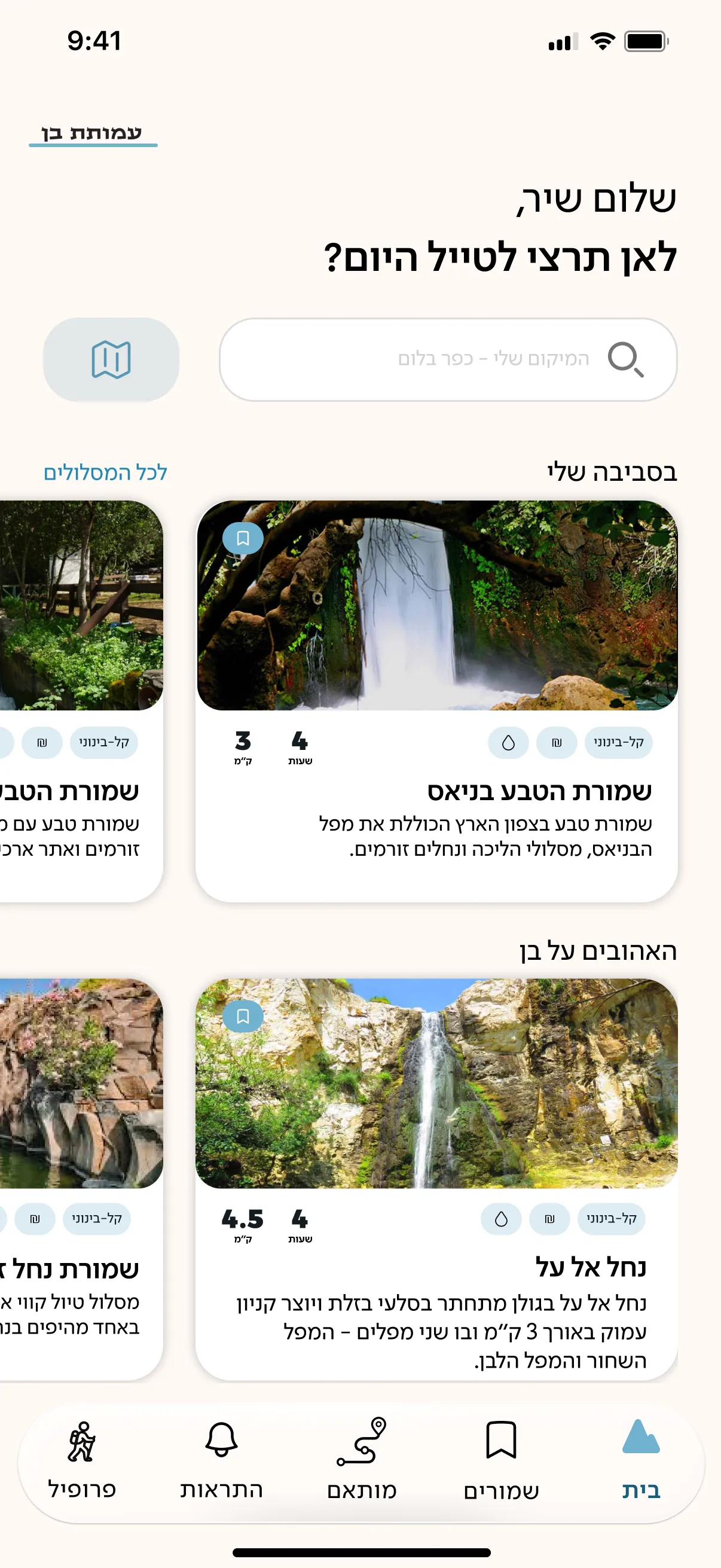
A trail that suits you, hikers to talk to on the way, and a quiet way to remember Ben.
- MediumDigital
- RoleUX/UI & Branding
- ContextVolunteer, academic project
- TeamFour people
About the project
Ben’s Way is a hiking app created in memory of Major Ben Shelly, who fell on 12 December 2023 during the Swords of Iron War. Ben loved hiking the trails of Israel, and the app invites hikers to follow in his footsteps: to find a trail that suits them, walk it, and connect with other hikers along the way.
The project began as a final-year project at Afeka College of Engineering, initiated by people close to Ben and supported by the association founded in his memory. I joined as a volunteer, as part of a small team of designers, a developer and a product manager.
My role: Another designer and I created the interface and the branding together, and most of the work was collaborative. My own focus was research and definition: I used Claude Code, Claude, ChatGPT and Figma Make to explore directions and create wireframes, built the app’s user flow, and created its icon language.
The challenge
Existing hiking apps provide technical information but don’t adapt to the individual hiker. Inexperienced hikers struggle to choose a trail: they aren’t familiar with how the country divides into regions, and the information on each trail is extensive and scattered.
User flow
Home screen
- Search for a trail
- A trail matched to me
- My trail
- Near me
- Ben’s favourites
- Saved trails
- Notifications
- Profile
- Link to the association
Search
- A map and the first cardScroll down for the listScroll up for the map and its pins
- Choose a trailFrom a pin on the mapFrom the list
- Trail cardShort descriptionDifficulty, distance, time, costSave or show the trail
- Trail pagePhotos and attractionsWhat is nearbySave, or start navigatingSend a ready question to its chat
Returns home
Matched trail
- Step 1: region
- Step 2: trail typeDry or wetWhat I want to seeAttractions
- Step 3: difficultyWho is comingLimitations
- Step 4: lengthKilometresHours
- Search results
- Trail card
Returns home
My trail
- The trail on a mapLength and timeWhere I am against the trail
- Set out nowOr save it for later
- NavigationEnd time and distanceDirectionsBack to my locationCompass
- ChatOpens only near the trailReady questionsHow many are connected
Returns home
Saved
- Every trail I saved
- Choose a trail
- Navigation starts
Returns home
Notifications
- New messagesSystem messagesChanges to a saved trailAn answer to my question
- Opens the relevant chat
Returns home
Wireframes
Home and search
Matched trail
Trail and navigation
Personal area
Key decisions
A map, not a list
Region selection takes place on a map of Israel. Hikers unfamiliar with the country’s regions find their bearings faster when they can see the area and understand where they’re heading.
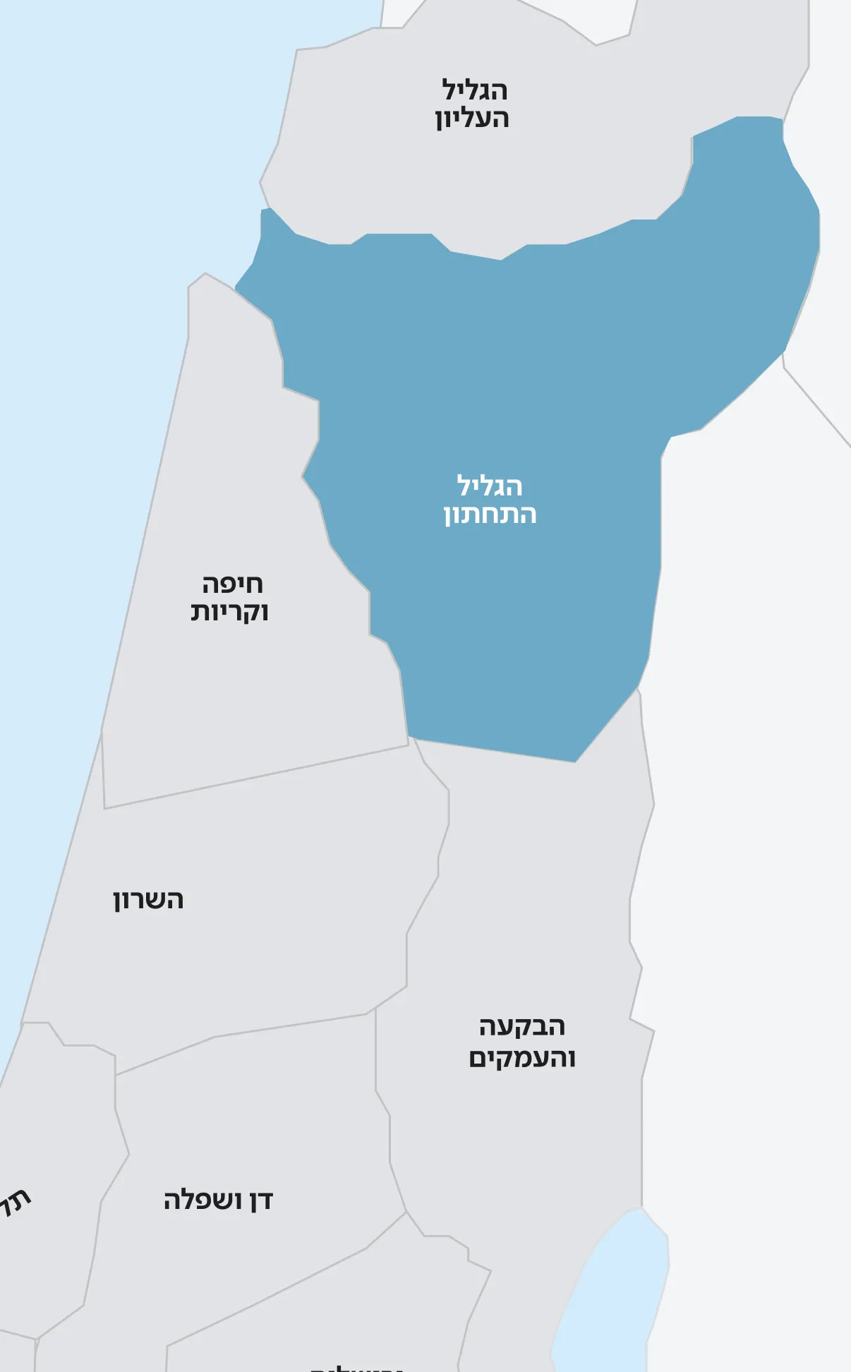
A four-step search
Region, trail type, difficulty and length. Four steps are enough for an accurate match without overwhelming the user.
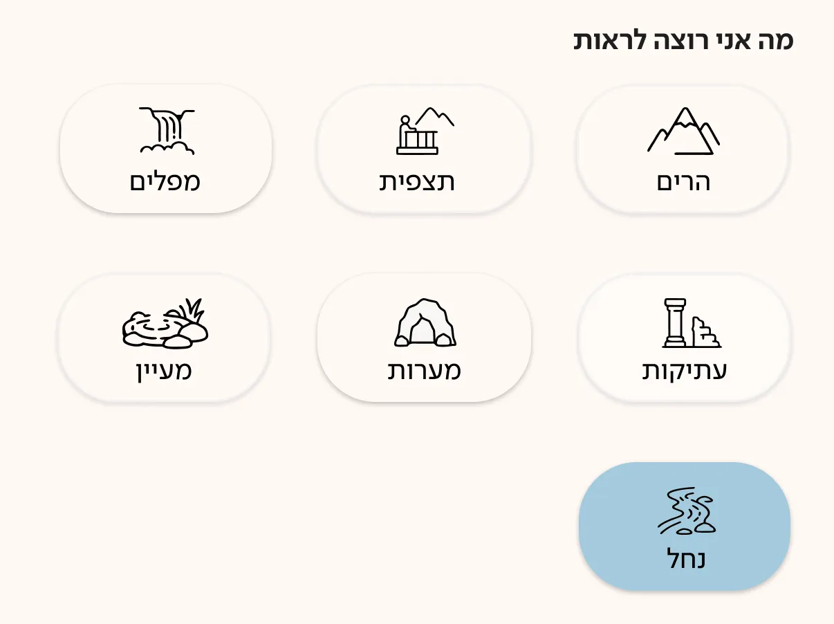
The four steps
01 Region 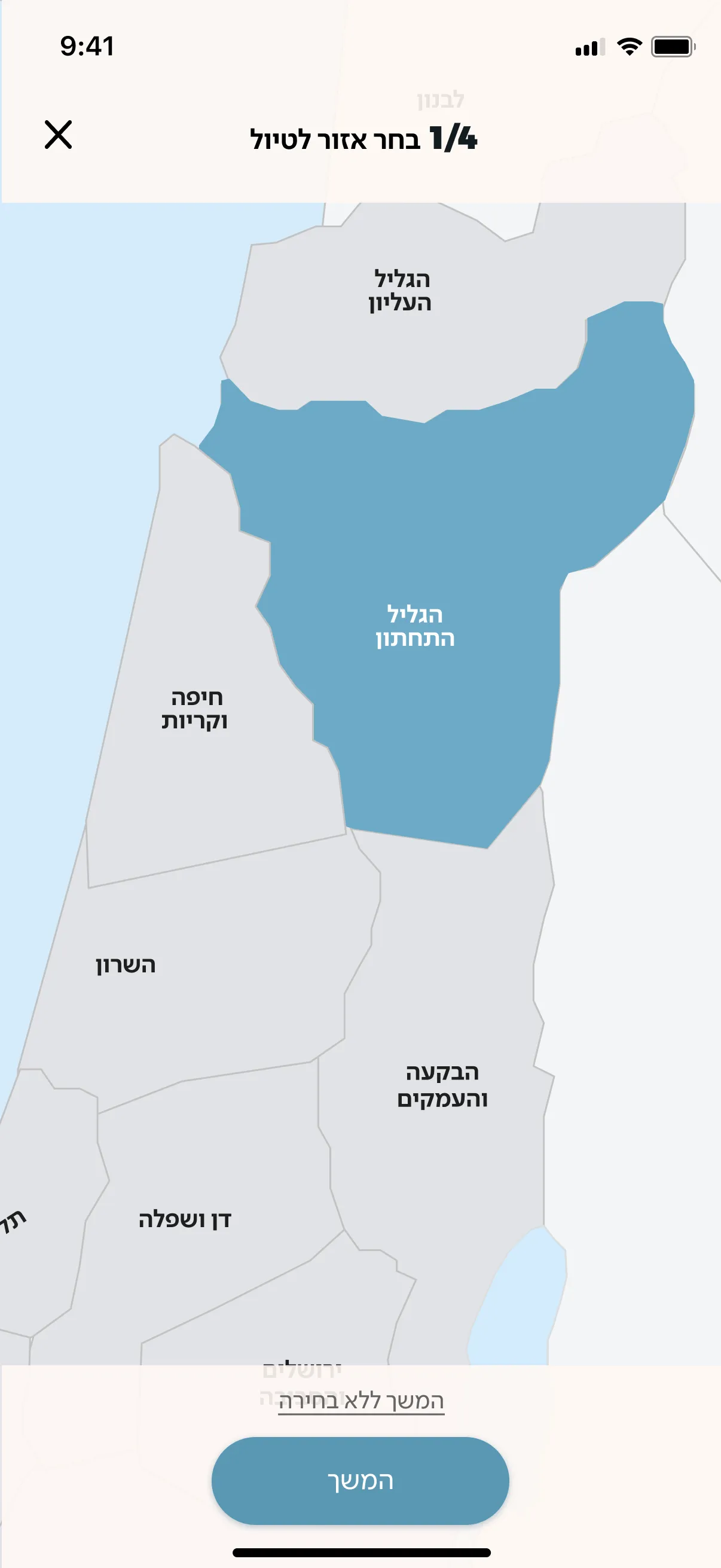
02 Trail type 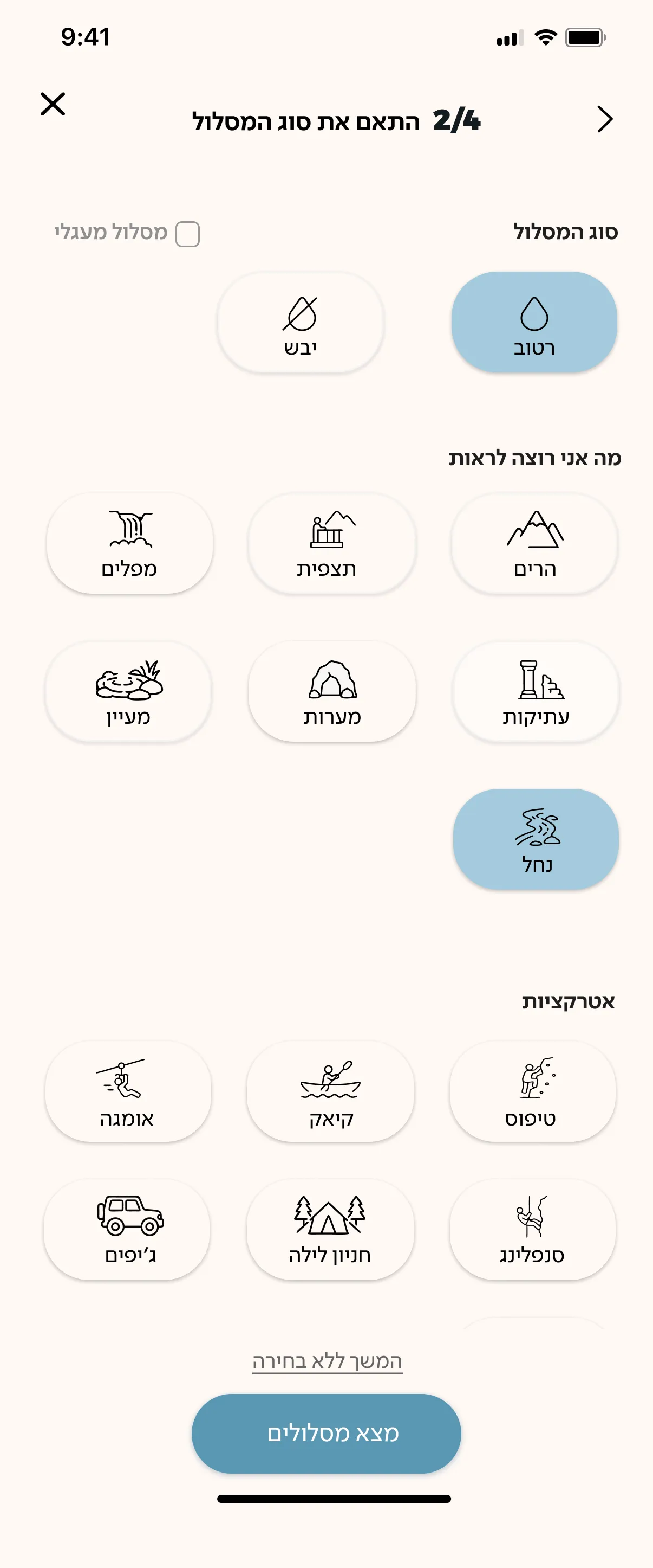
03 Difficulty 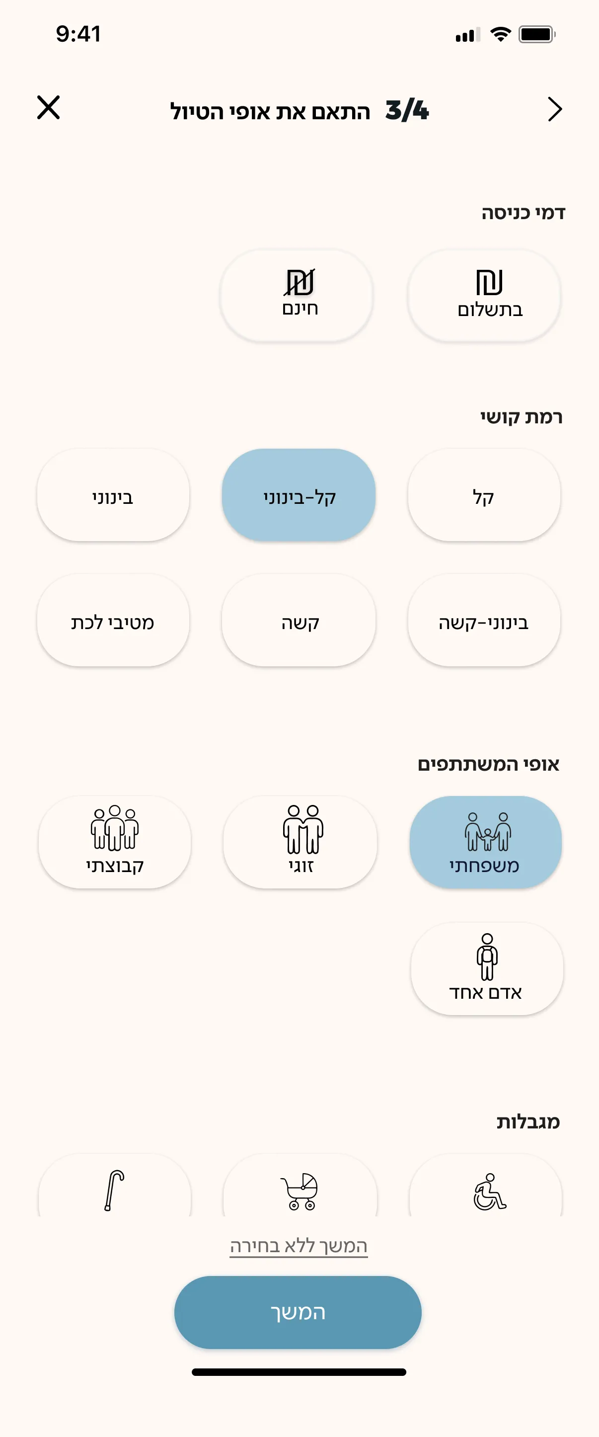
04 Length 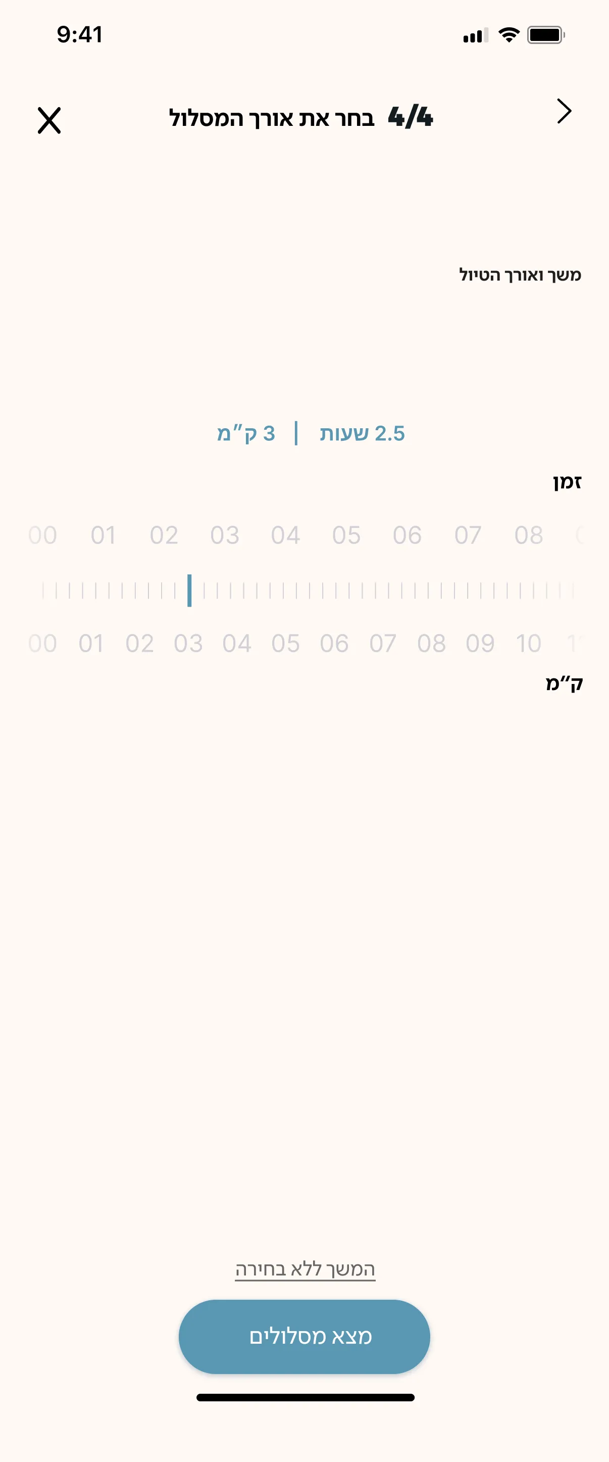
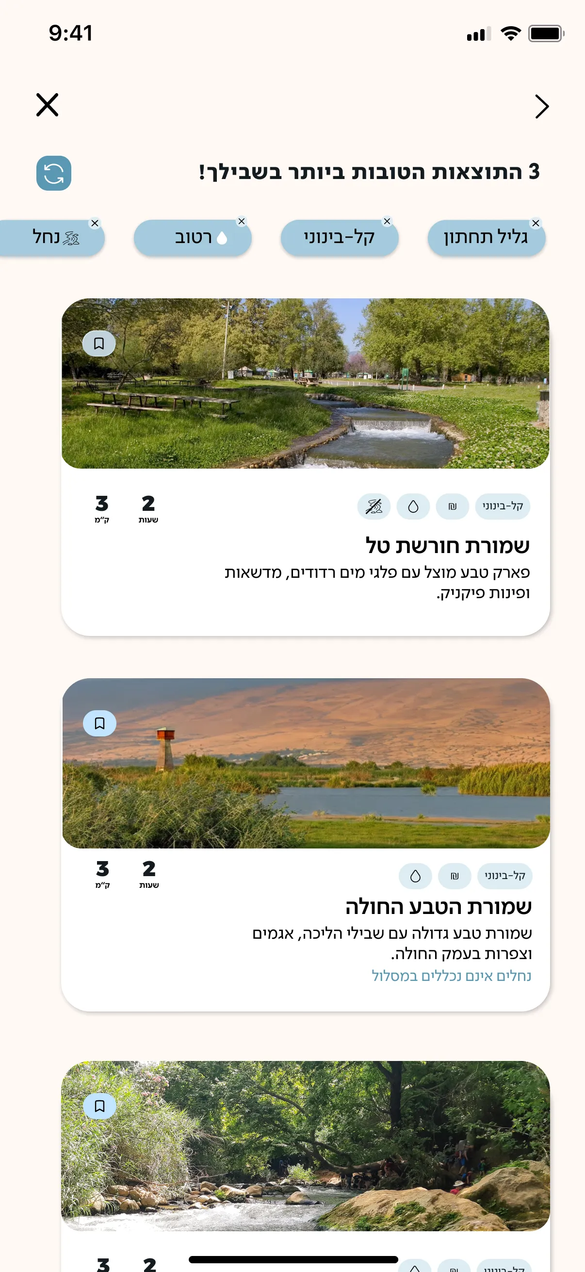
Three matches
At the end of the search, the user receives just three results. Narrowing the options makes the decision easier, letting the user choose from a small selection that fits what they asked for.
The trail page
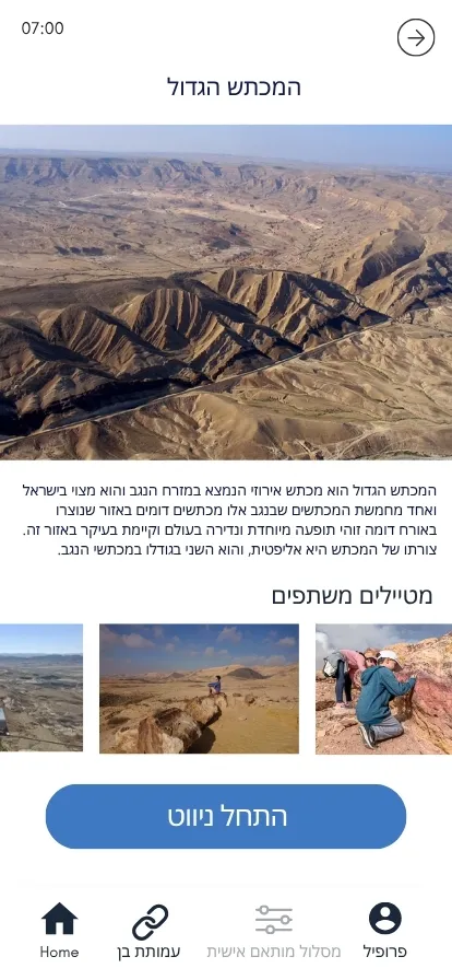
Atmosphere first, with a large image that can be swiped through almost full screen. Directly below it, on the same screen, come the practical details: opening hours, distance, walking time, rating, difficulty, cost and water availability.
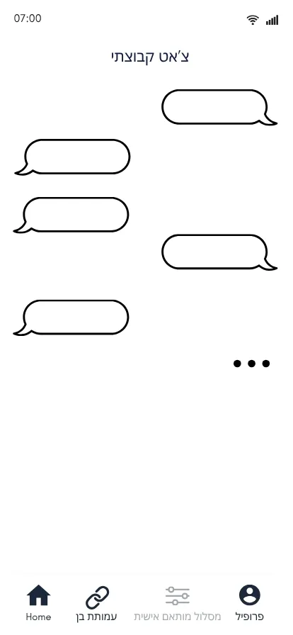
A two-mode chat
On the trail, an open chat connects everyone currently walking it. Off the trail, focused questions help users decide whether to go.
On the trail 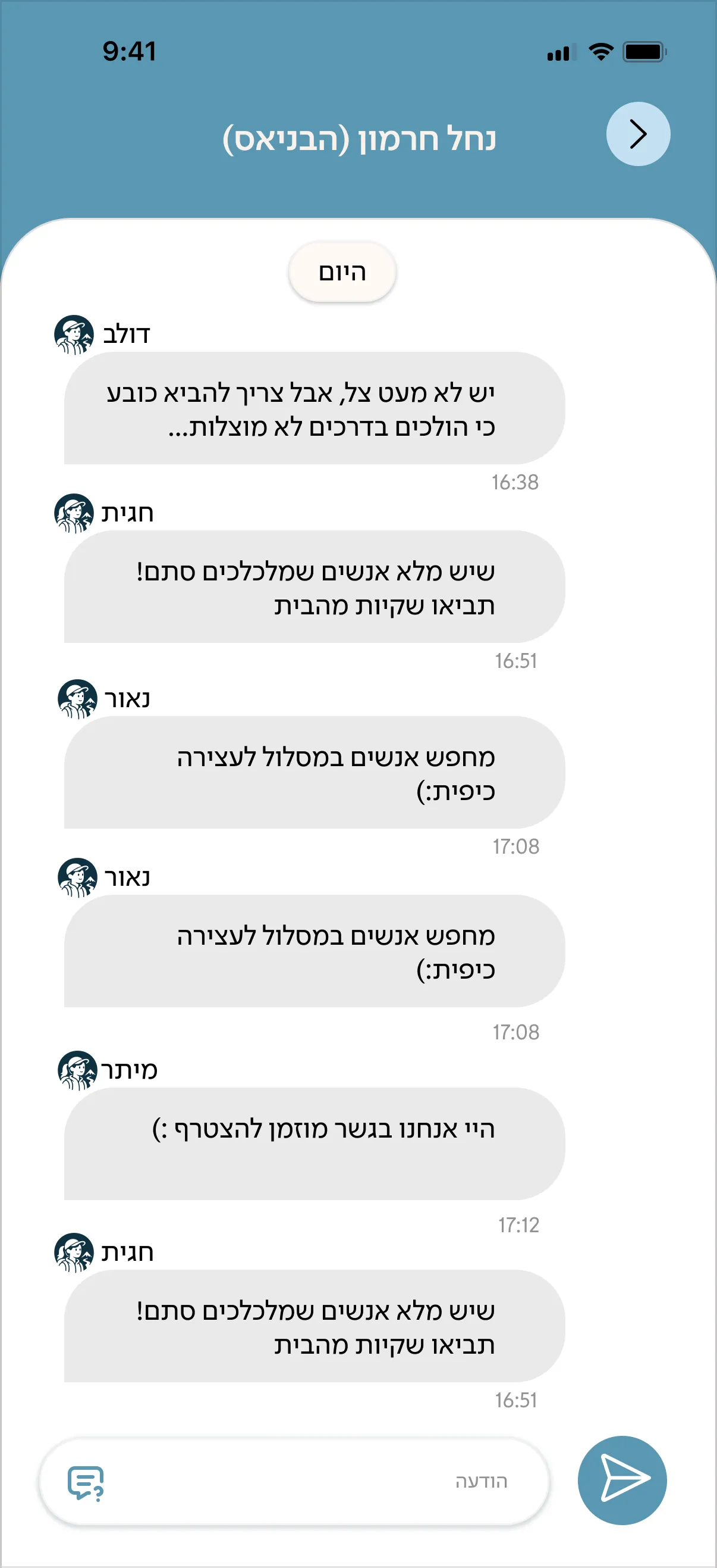
Off the trail 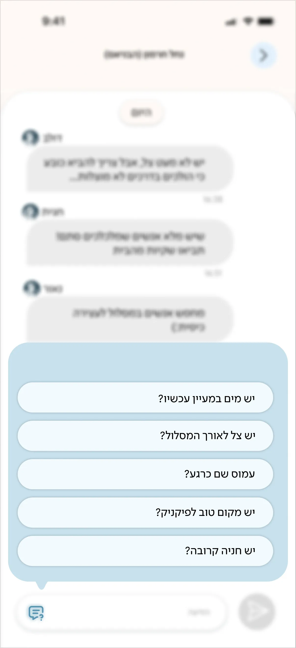
Icon language
I wanted the icons to carry details that make the app distinctive, rather than the generic icons found in any app. Working with AI tools, I developed a set that speaks the language of hiking: the home screen is marked by a mountain instead of a house, the set includes a hiker figure, and the profile icon is an illustration of a male or female hiker.




 on the map

Ben, within the design
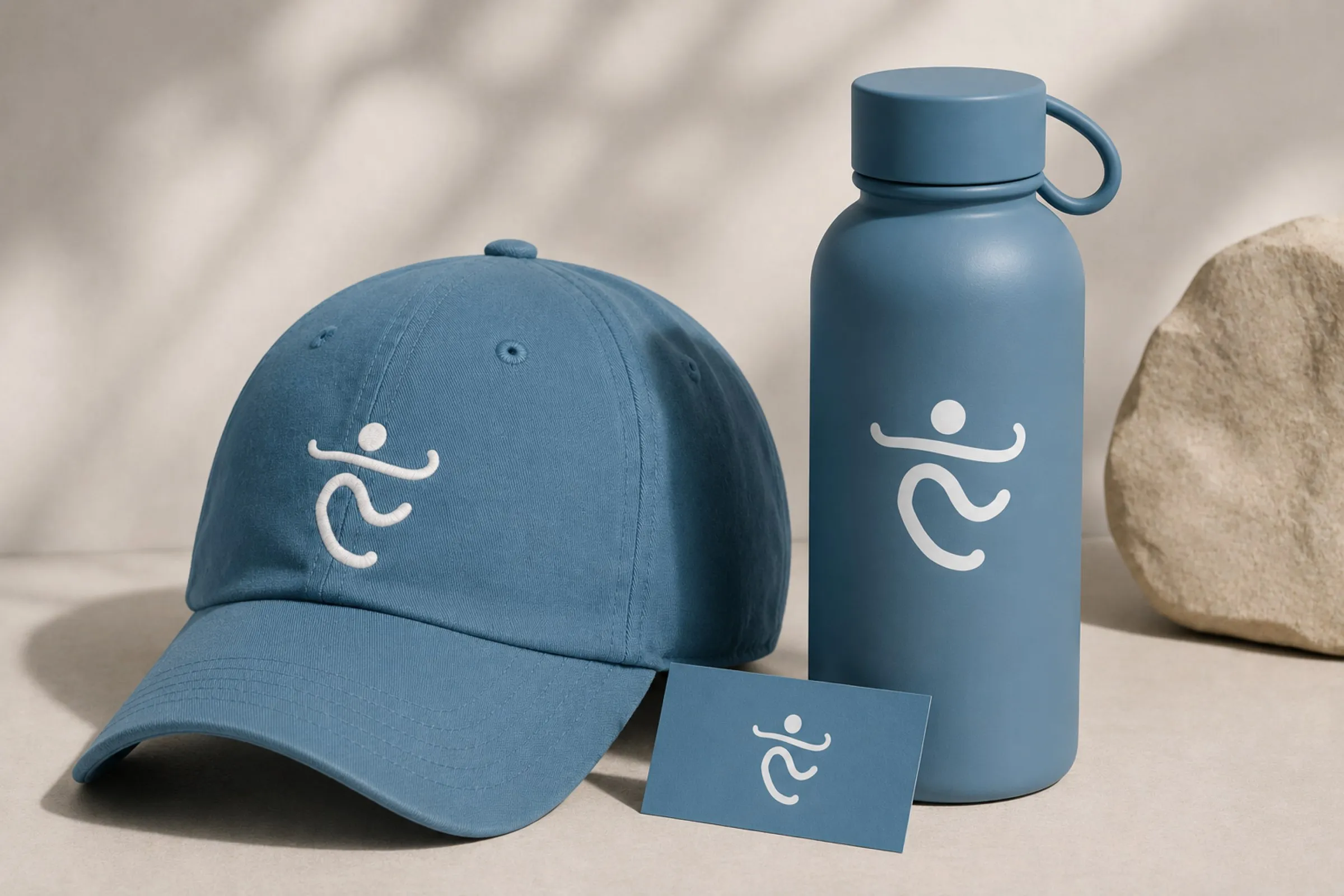
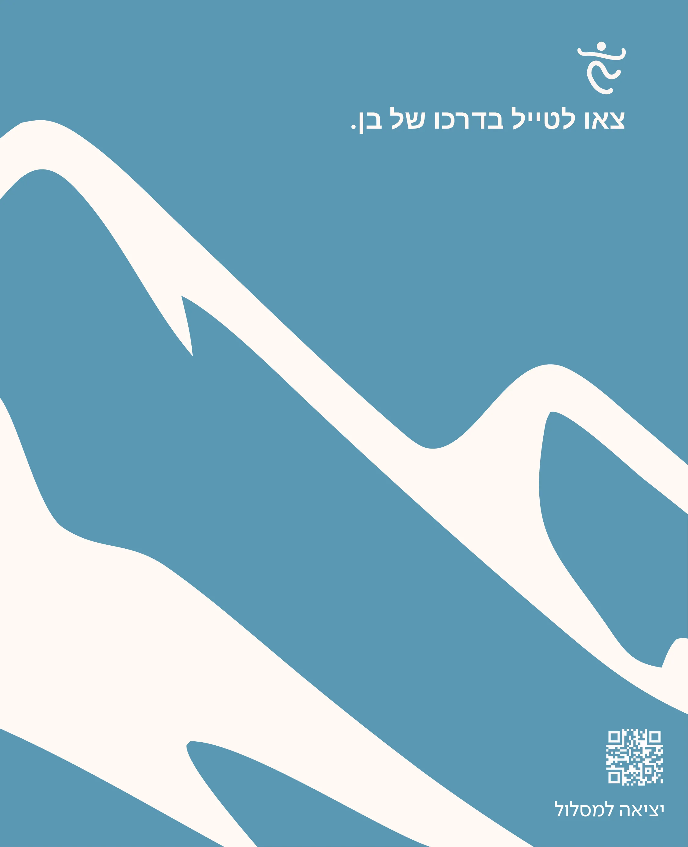
Ben is present through the app’s visual language, not its user flow. The logo was built from his handwriting, taken from a letter he wrote to his partner, and its shape draws on the outstretched arms that appear in many of his photos. The blue is his favourite colour, and the home screen features his favourite trails. A single tab links to the association’s page.
We deliberately chose not to include messages in his name or memories along the trail. Most users never knew Ben, and for his family, the app’s use is itself the remembrance.

His handwriting
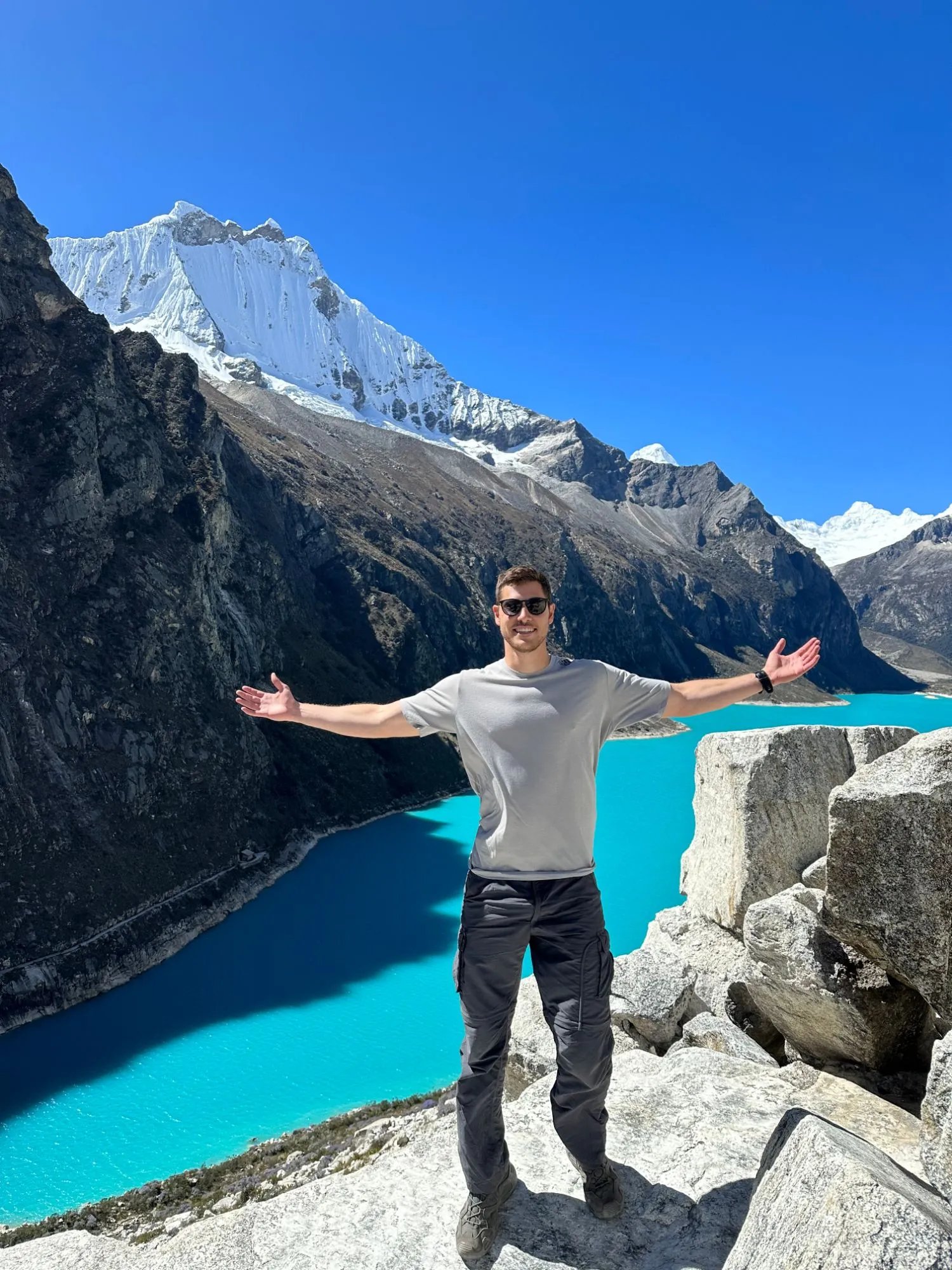
The outstretched arms

The logo
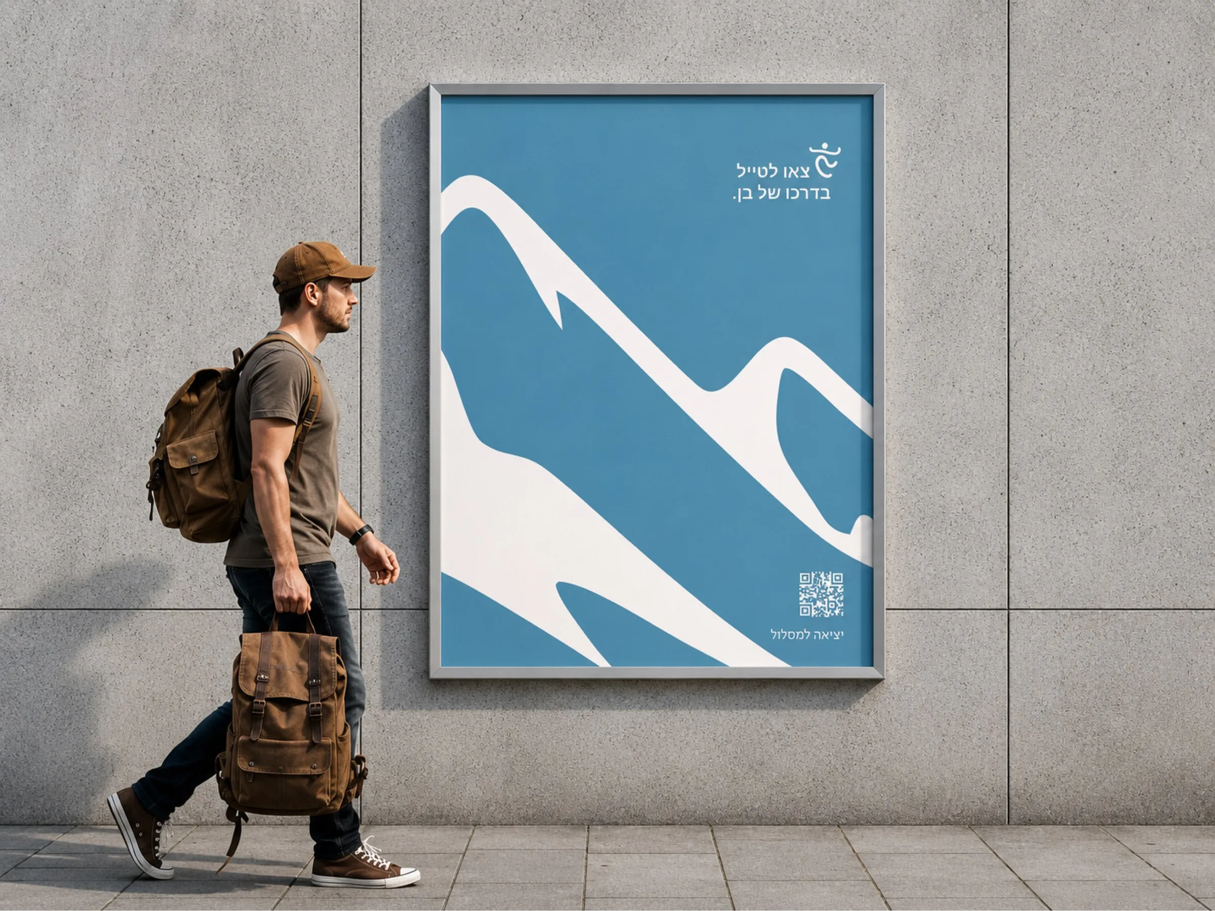
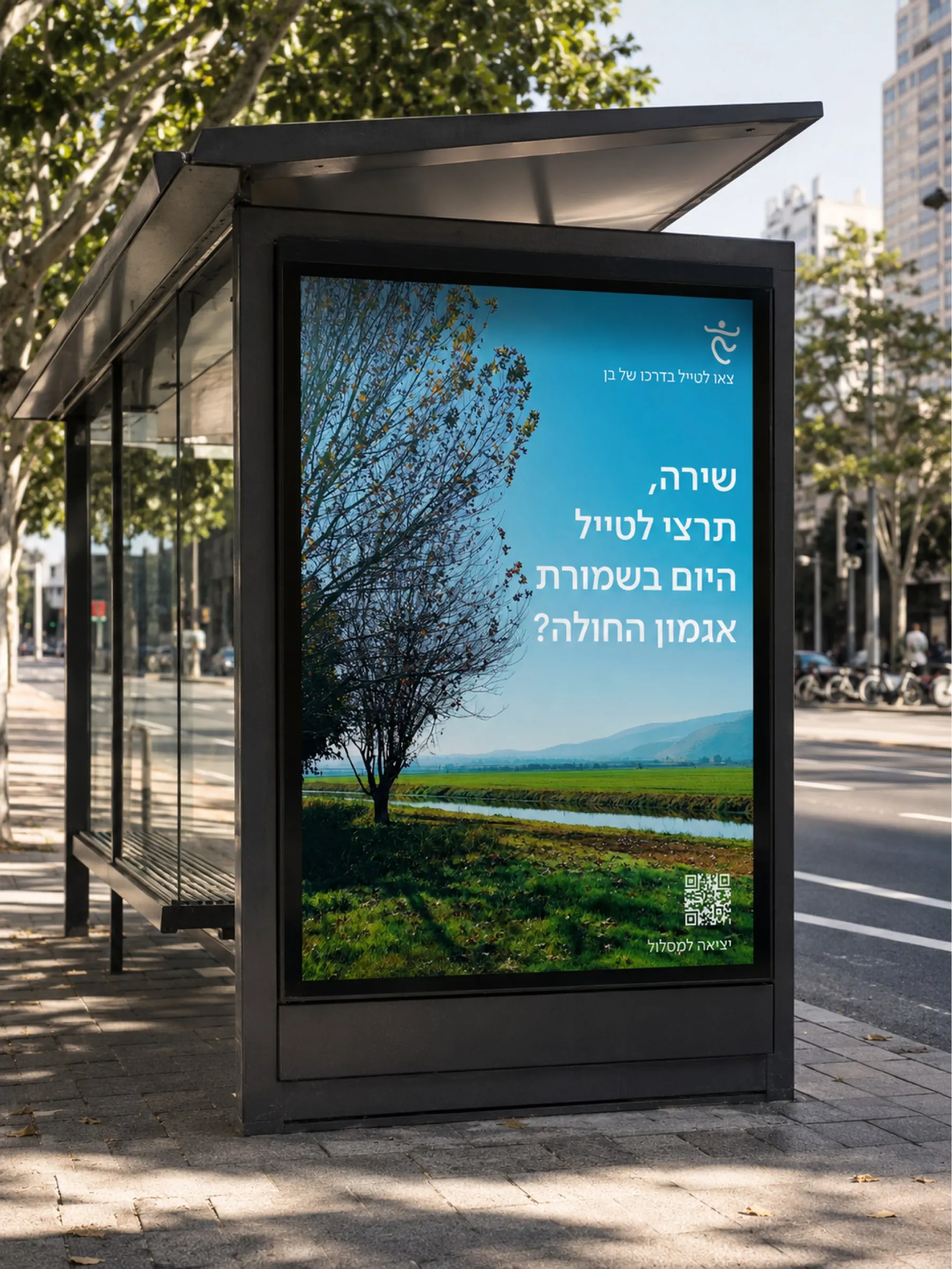
The branding carries the same approach beyond the app. The posters address each person by name, for example: “Shira, would you like to go hiking at Agamon HaHula today?” The whole app rests on emotion, and we wanted that personal address to come through in the branding too.

From prototype to product
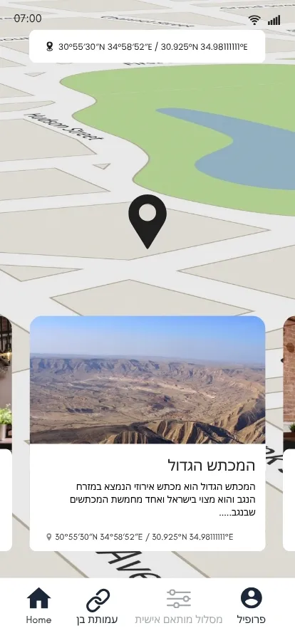
We started from an early prototype built by the project’s initiators. The trail page and the search screens went through many iterations: there was a great deal of information, and the challenge was to present it without overwhelming the user.
- Prototype
 Final
Final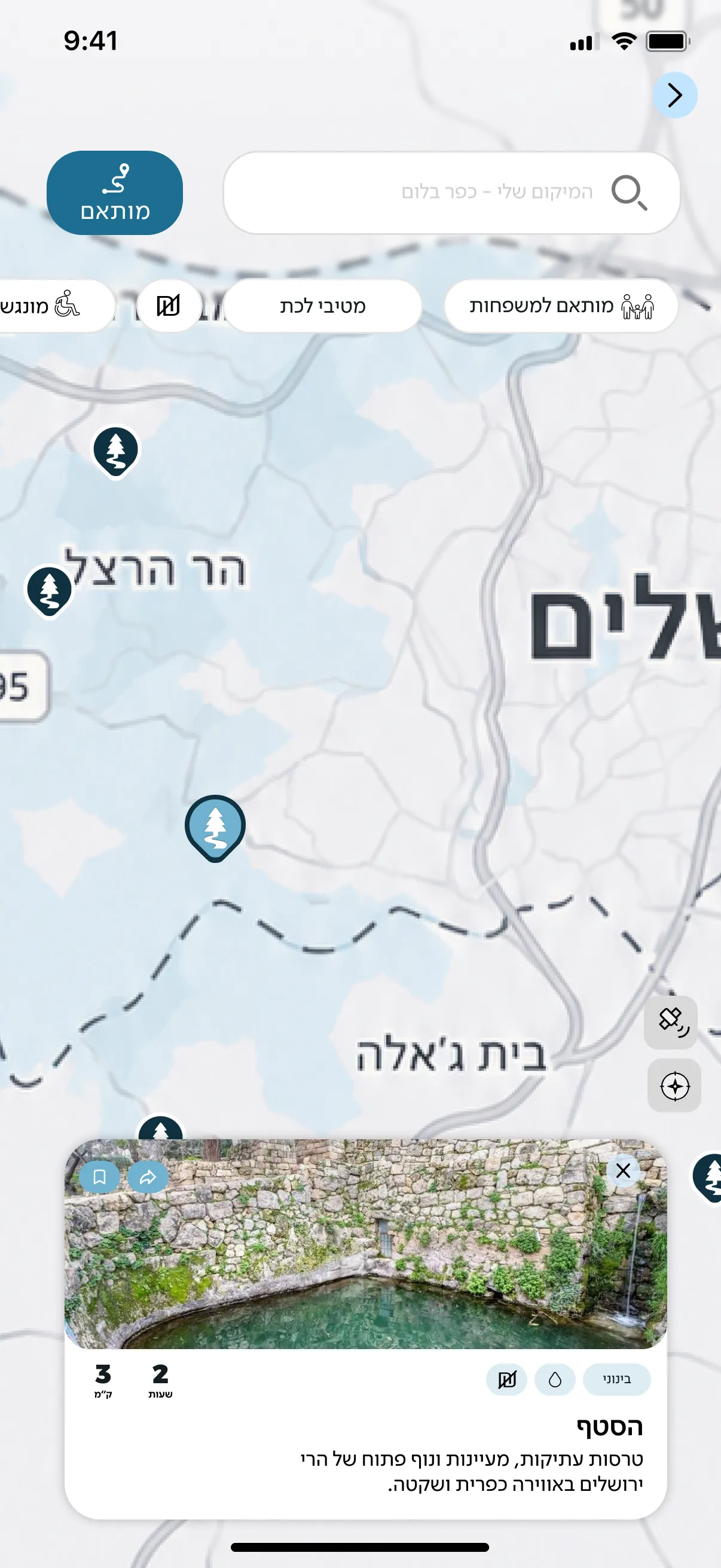
The map search
- Prototype
 Final
Final
The trail page
- Prototype
 Final
FinalThe chat
The initiators’ prototype alongside the final design.