2026
Aleph
Homage to Michal Sahar
- Typography
Michal Sahar’s three typefaces, in a catalogue that presents her work as a complete visual system.
- MediumPrint
- RoleDesign, research, print production
- ContextCourse project
About the project
The catalogue was born out of admiration for her work.
Aleph, Homage to Michal Sahar examines three typefaces by Michal Sahar: Fedra Hebrew, Masada, and Greta Text Hebrew. The typefaces are characterised by a wide range of weights, a historical foundation, and trilingual support.
Typography is the field that draws me more than any other. When it came time to choose an artist for the catalogue, I knew I wanted a typographer, and I chose Michal Sahar: a contemporary type designer whose work influences visual culture in Israel.
This catalogue is my semester project for the Artist Catalogue course, under the guidance of David Moskovitz and Tal Fransky.
Process
Research
I went looking for Michal’s typefaces at work in the Tel Aviv Museum of Art, in its own branding. Then I interviewed her. I came away with material, and with answers to things I hadn’t been sure of. I understood how she arrived at the work she does today.
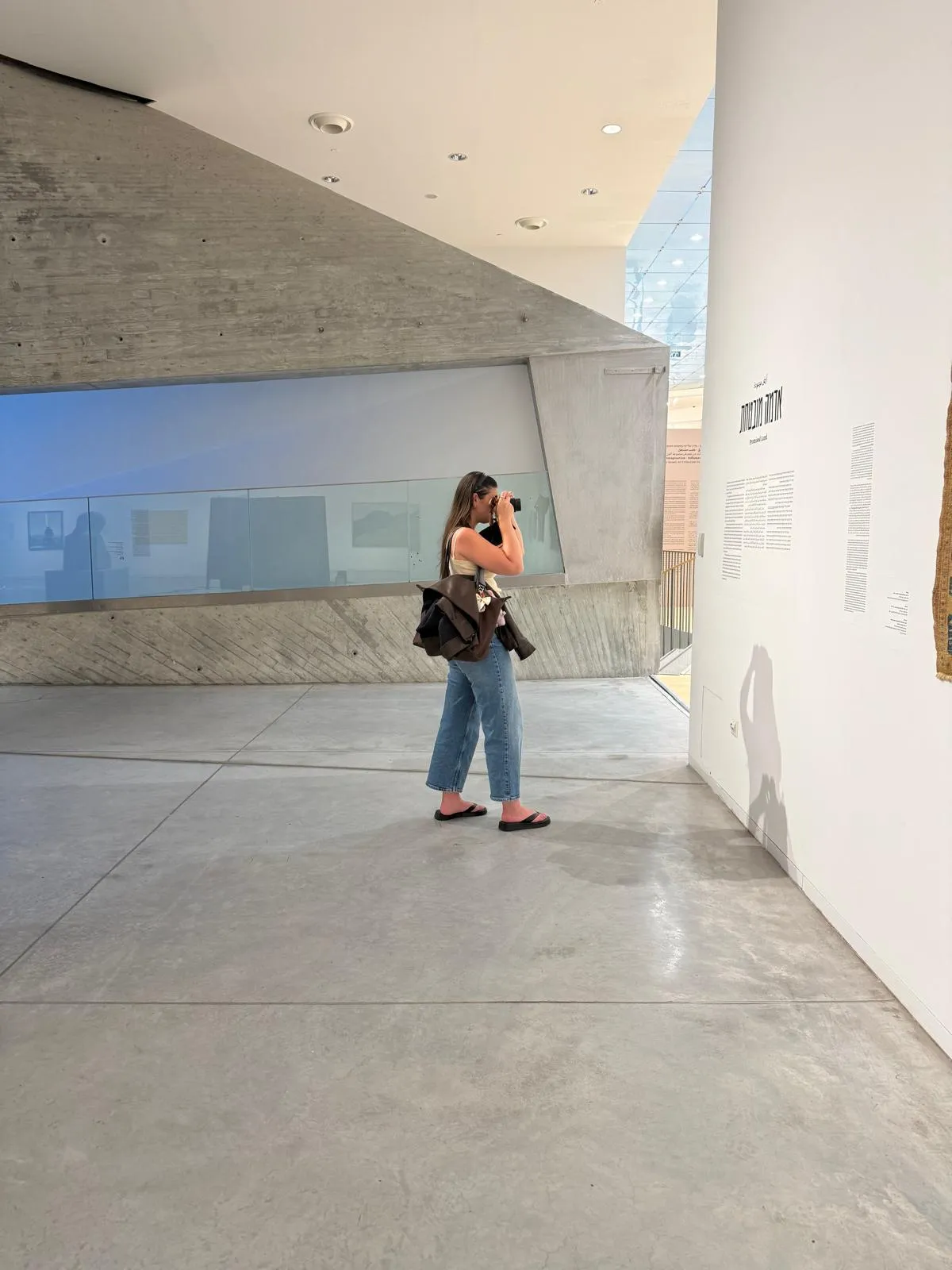
At the Tel Aviv Museum of Art. 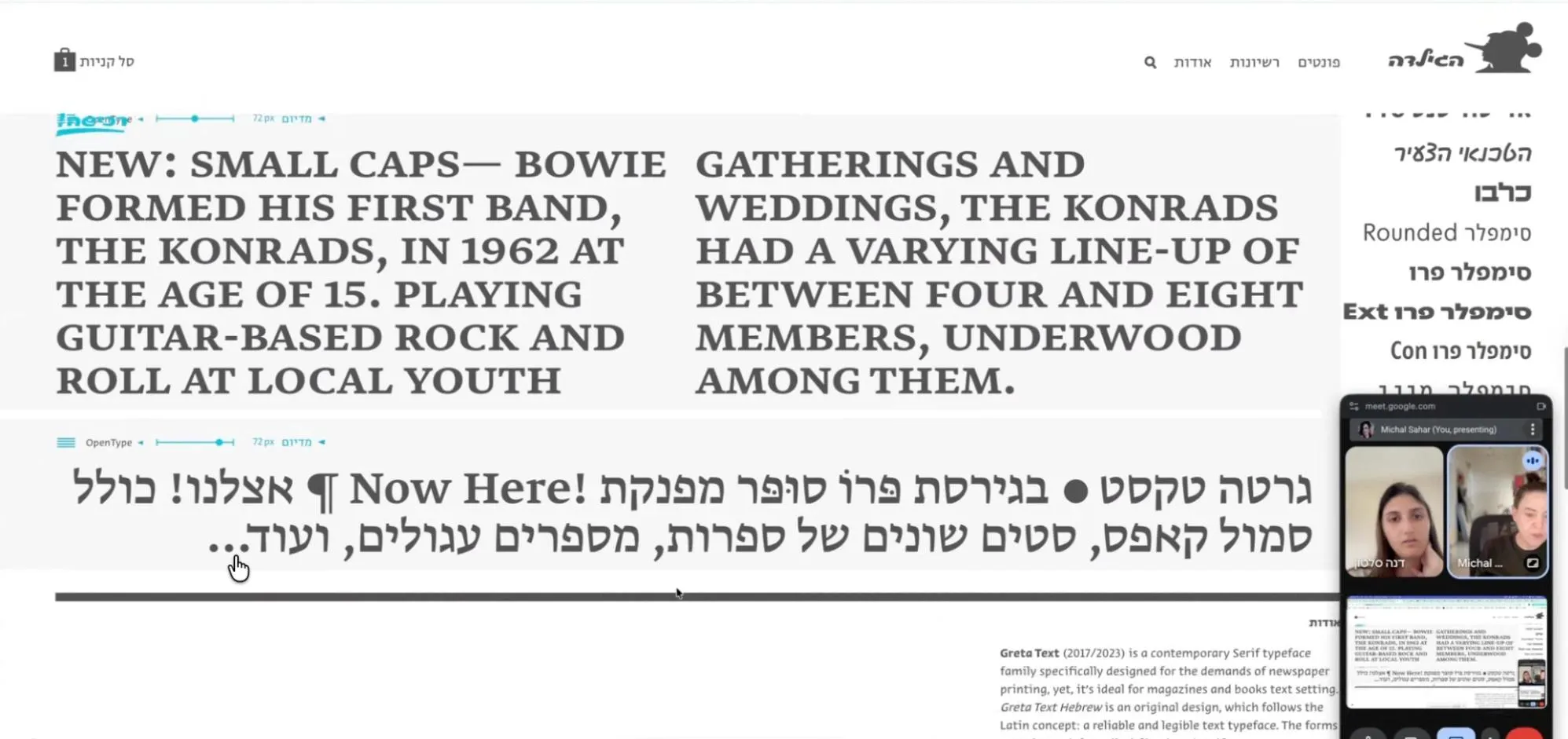
Michal Sahar walking me through Greta Text, in our interview.
The grid
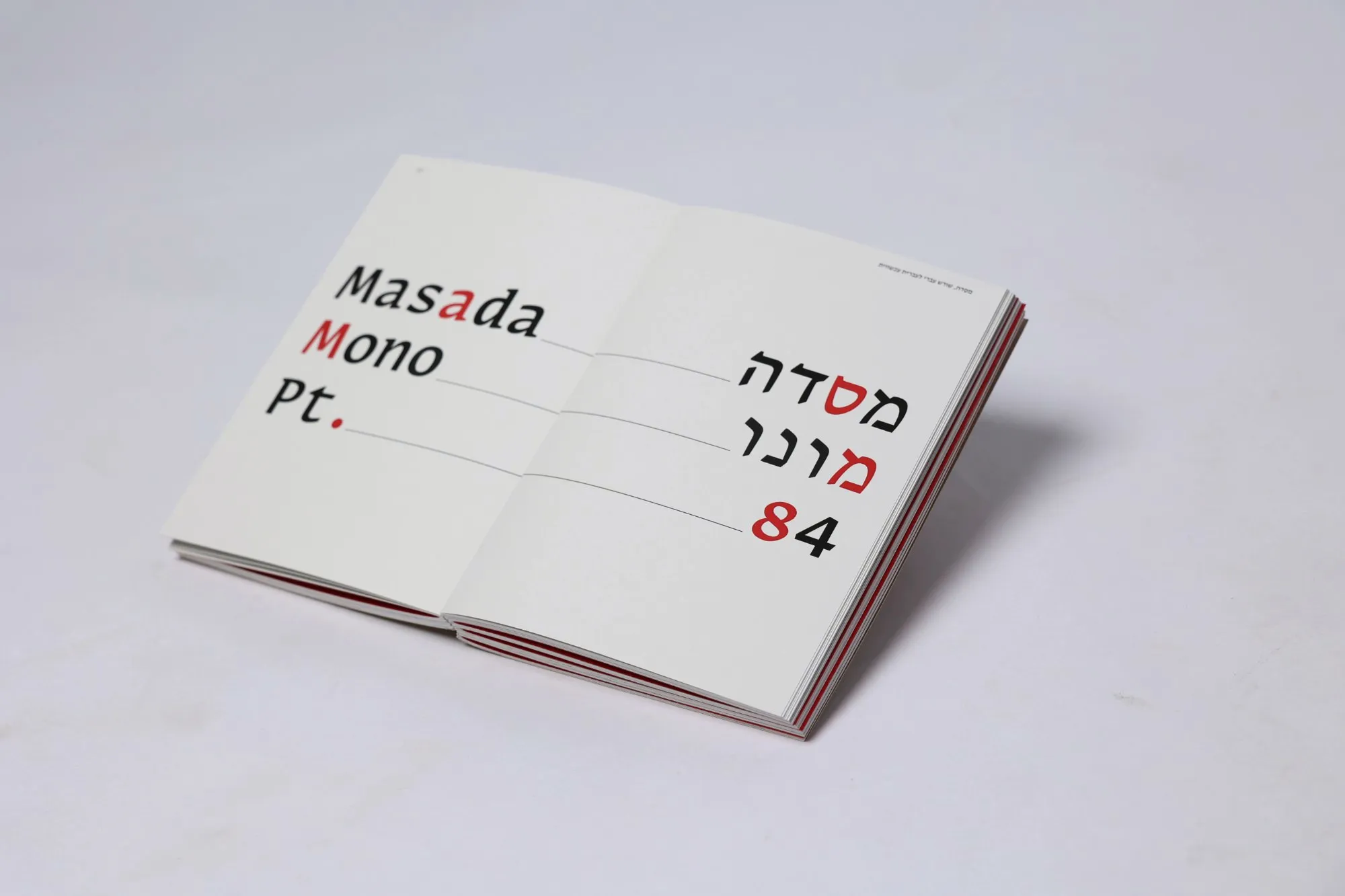
The object, a letter or a picture, always stands at the centre. The text goes in the margins, still inside the columns.
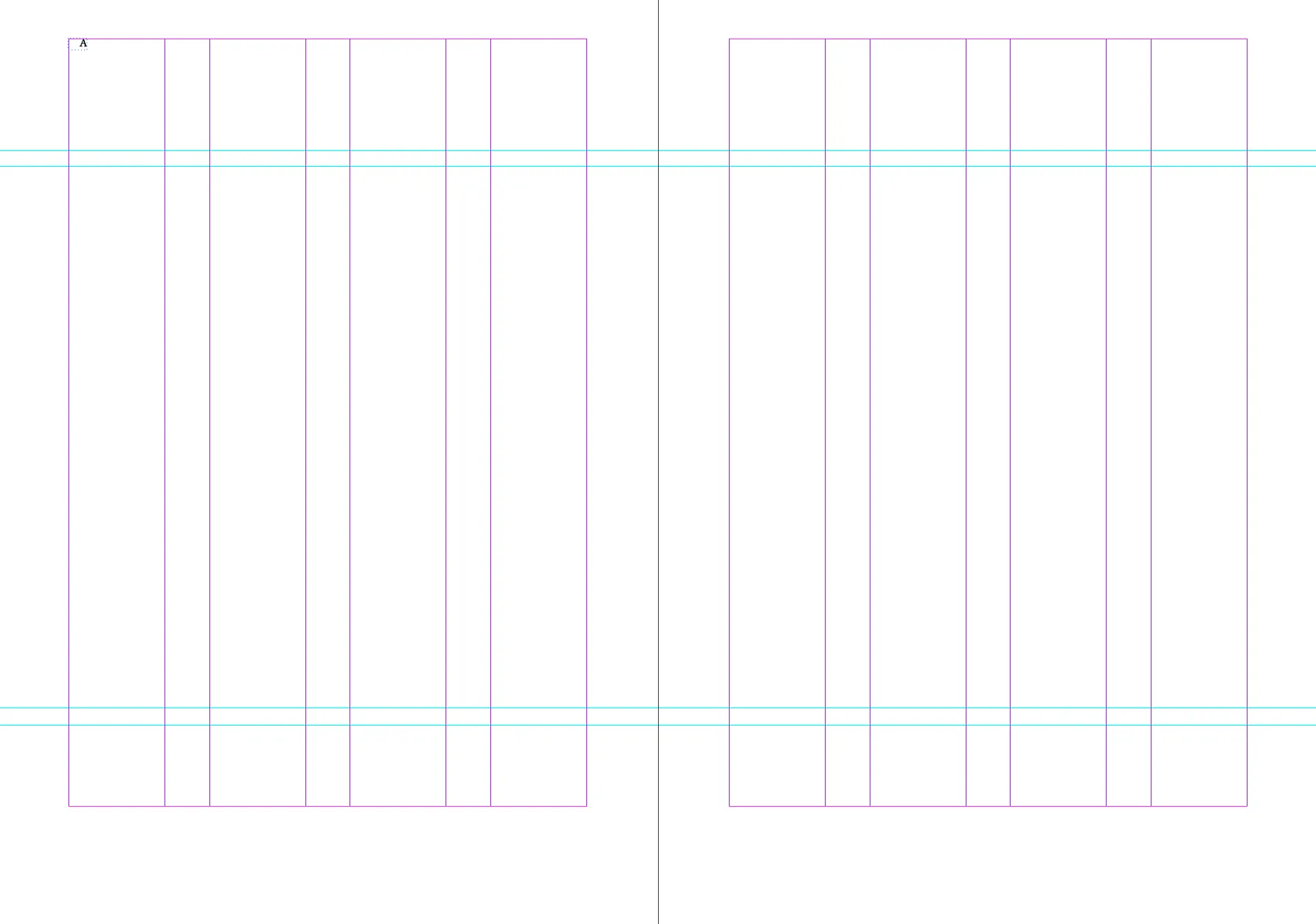
The grid, empty. 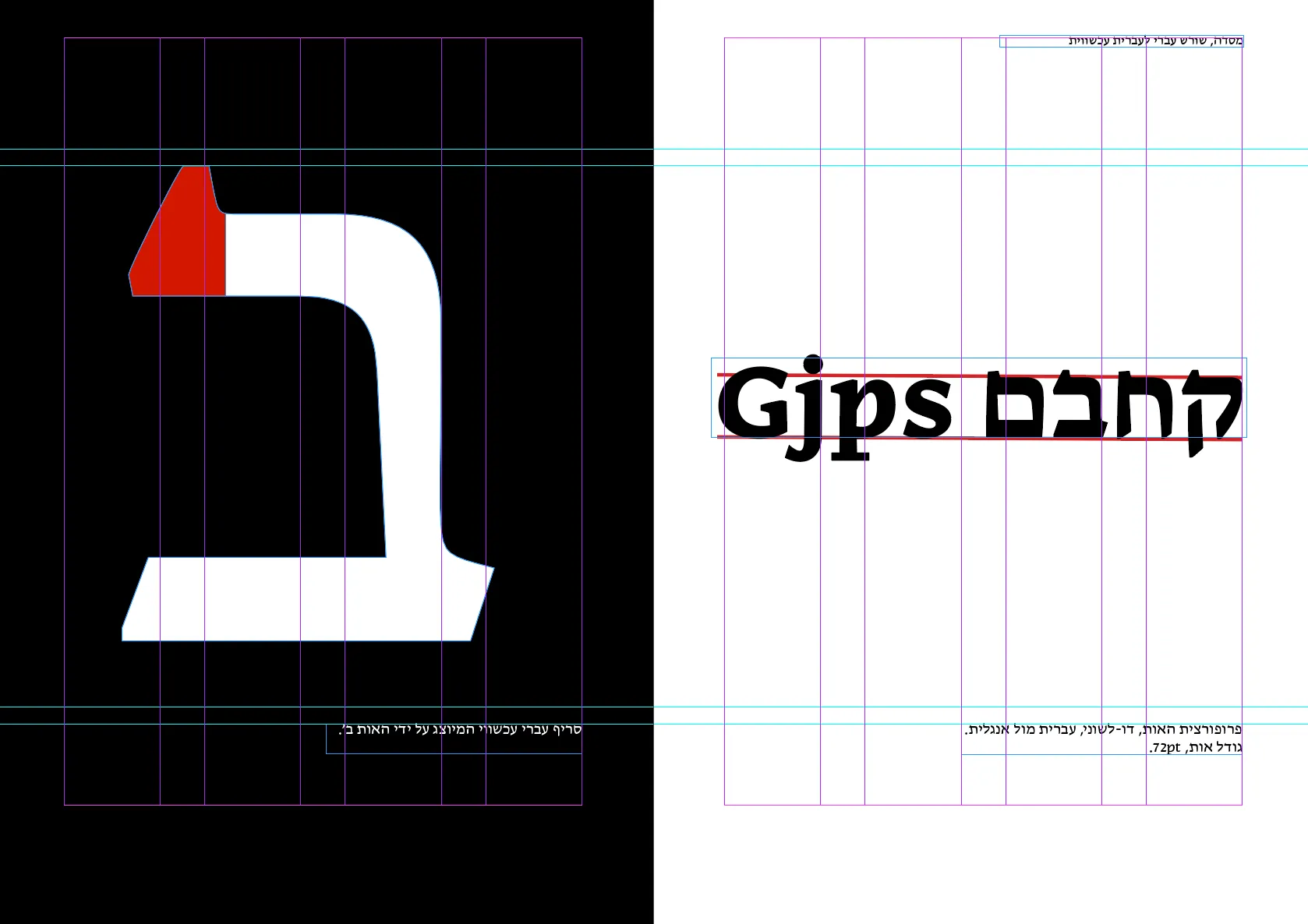
Masada: the letter at the centre, the words in the margin.
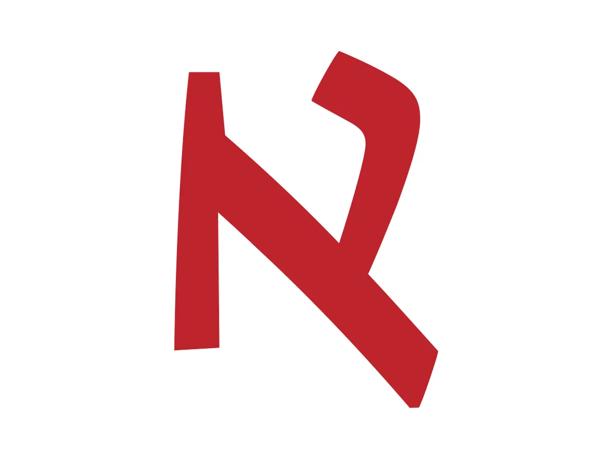
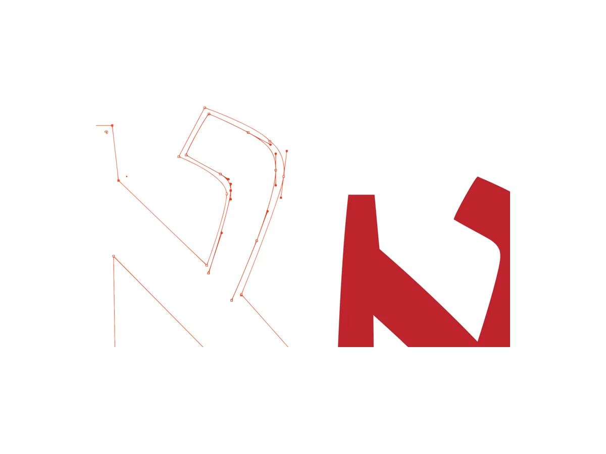
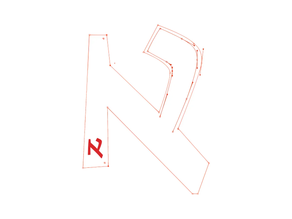
Covers that didn’t make it
Three of the many sketches for the cover, tried and set aside before the final one.
Key decisions
Name and cover
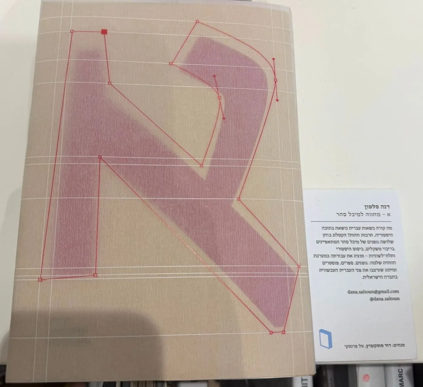
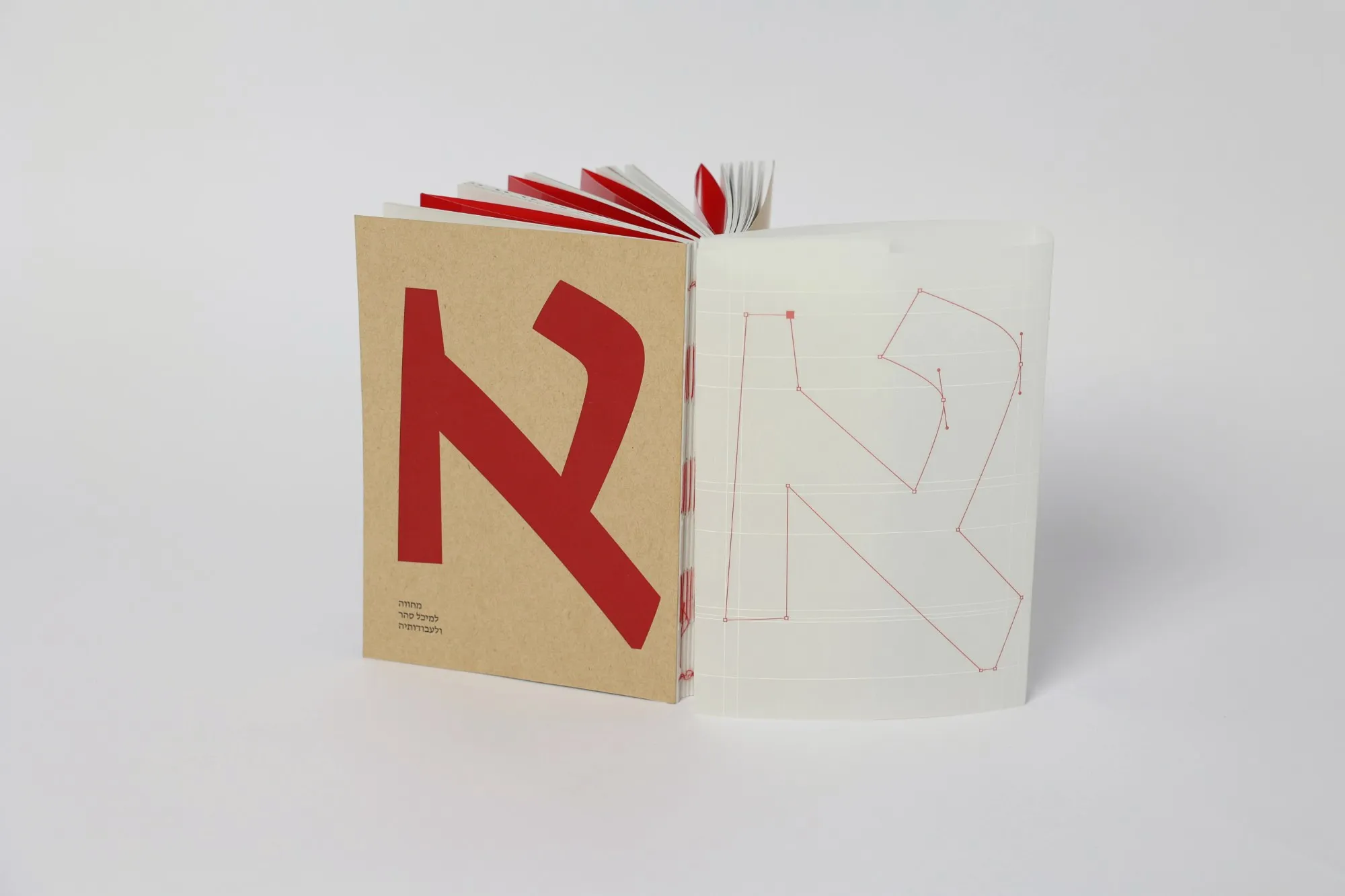
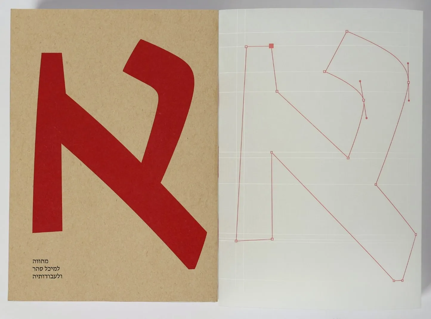
All three typefaces are present on the cover itself.
I looked for a letter that could be broken into three parts, matching the number of typefaces in the catalogue, and chose Aleph (א), the letter that signifies beginning and opening. I deconstructed it into three parts and assembled a new Aleph, with each part built from a different typeface: Fedra, Masada, and Greta.
Typography
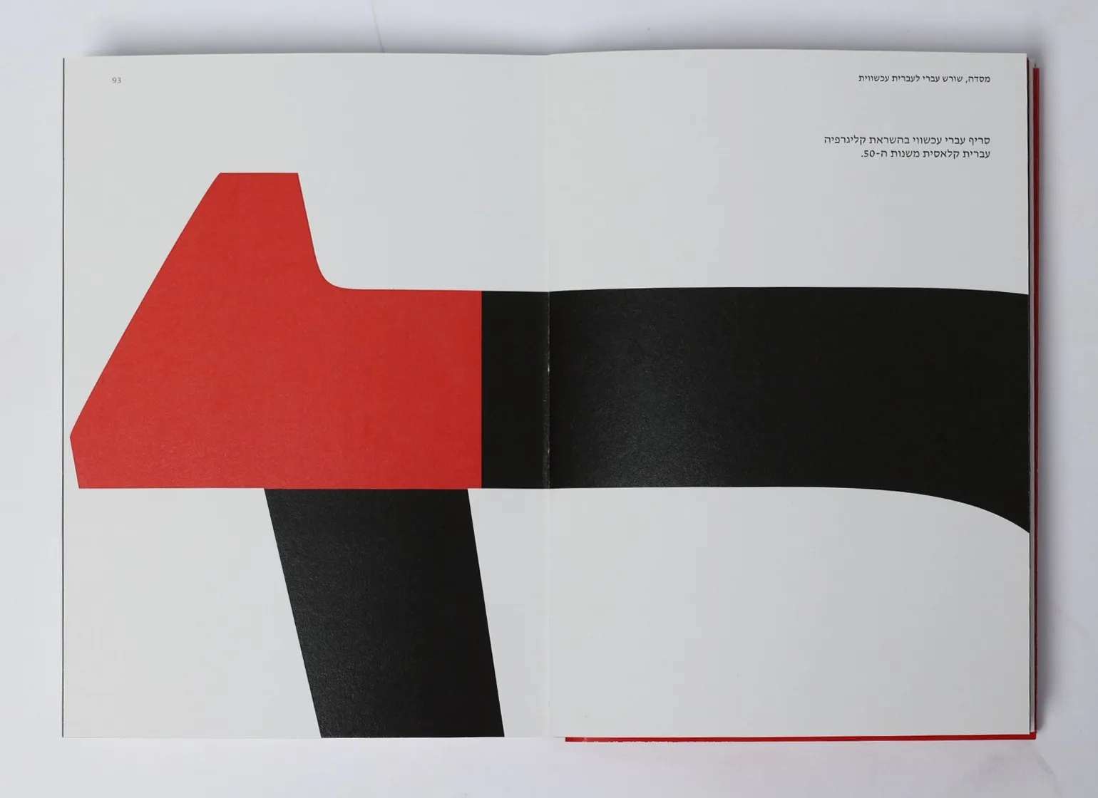
Each chapter is set in the typeface it presents.
The chapter openers display that typeface across its weights. The introduction and the final chapter are set in Greta Text Hebrew, a typeface designed for running text and therefore suited to continuous reading.
Material
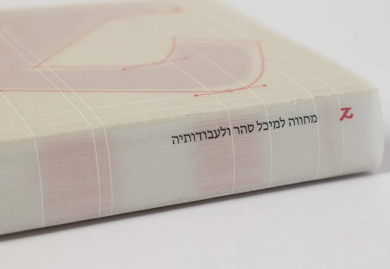
The cover is made of kraft.
A paper produced from wood pulp, as an echo of the wood type once used in letterpress printing. The interior is printed on uncoated DALUM paper with a greyish tone.
Red under red
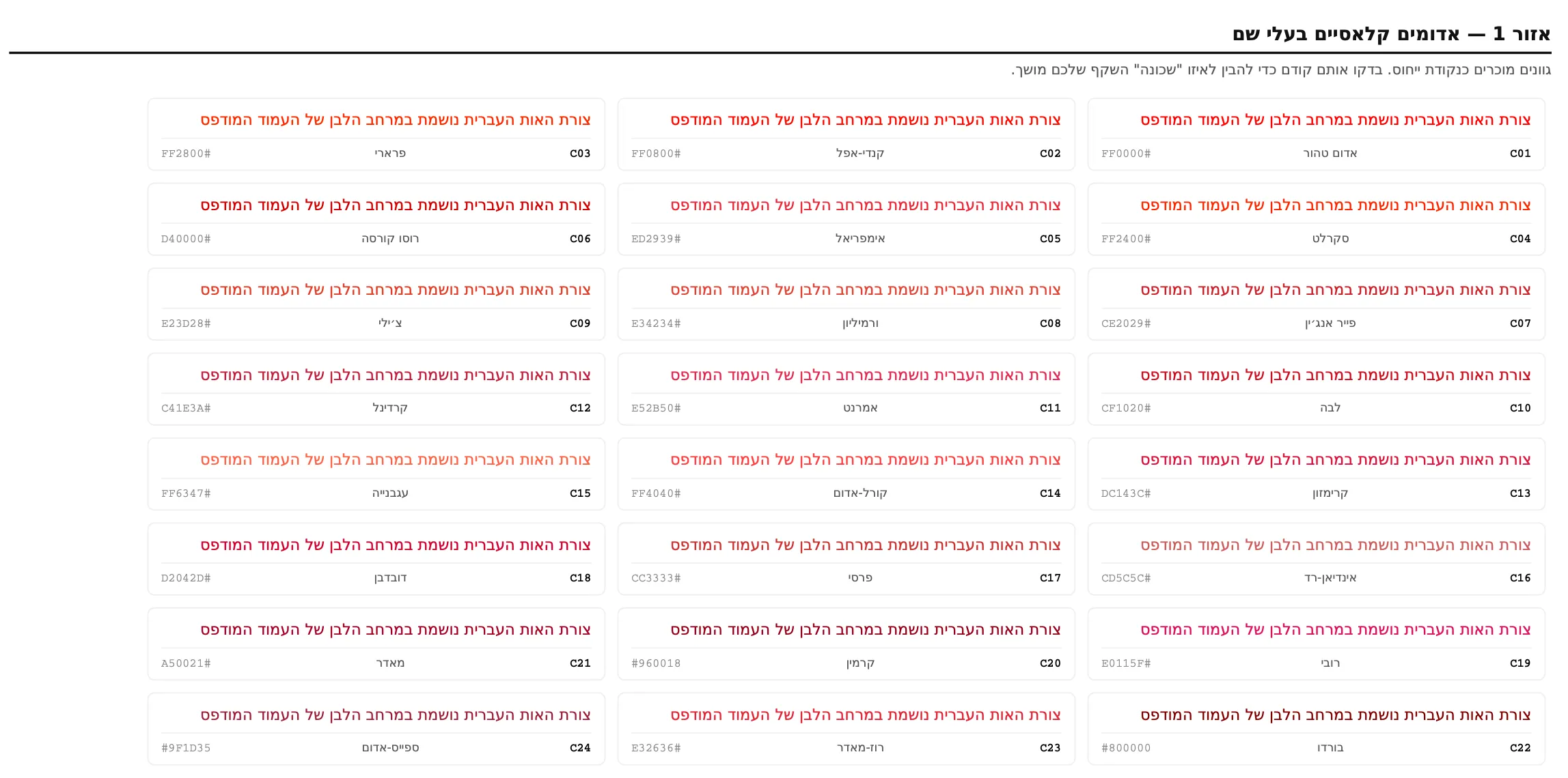
A red chosen to disappear.
Under a red film sits a passage that shows selected weights of the typeface. I printed about 120 reds on the catalogue’s own paper and laid the film over them, to find the one that hides best: #D21600.
The opener, from first trial to the film
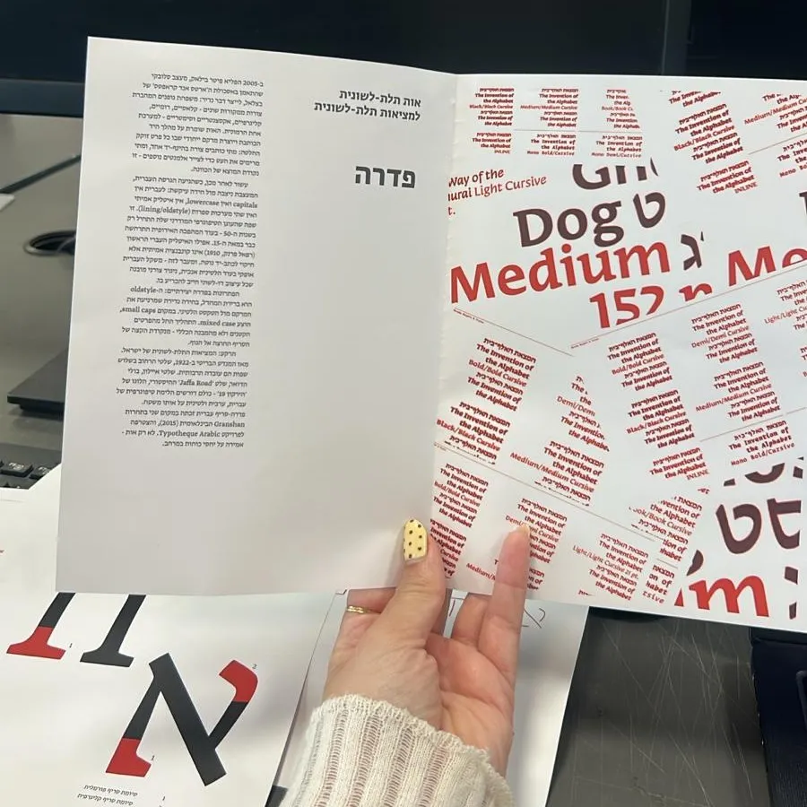
A very first trial, and beside it an Aleph that shows the kinds of serif. 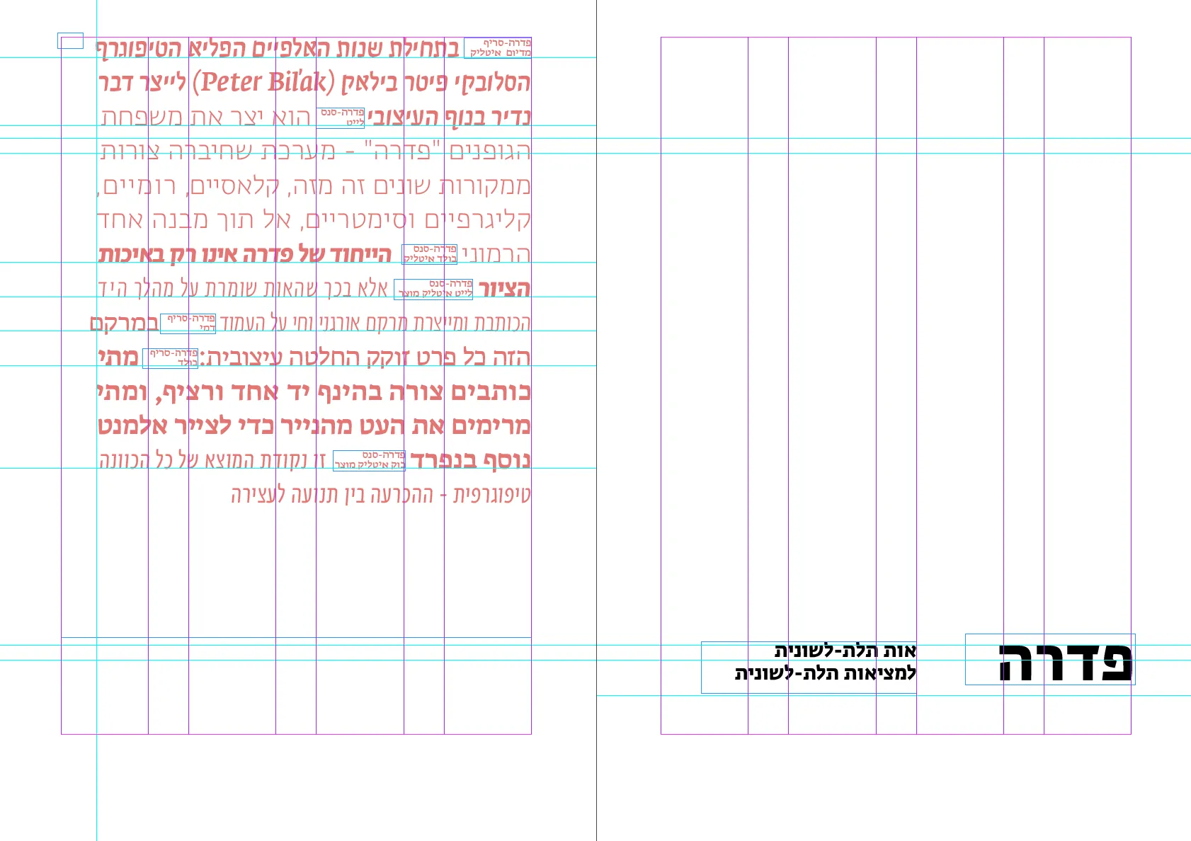
The passage, set on the grid, before the film. 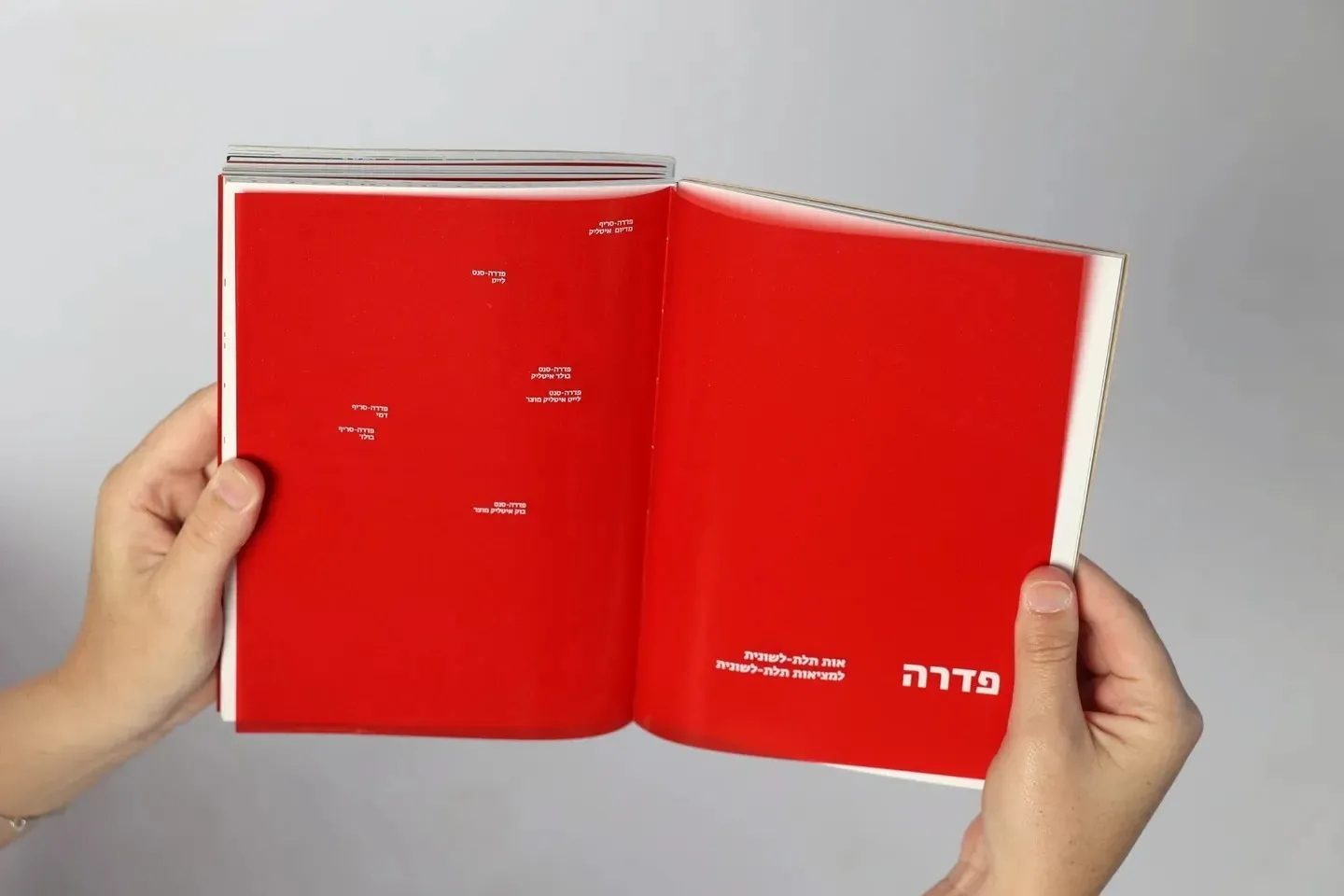
The final opener, under its red film: the passage disappears, the names of the weights stay.
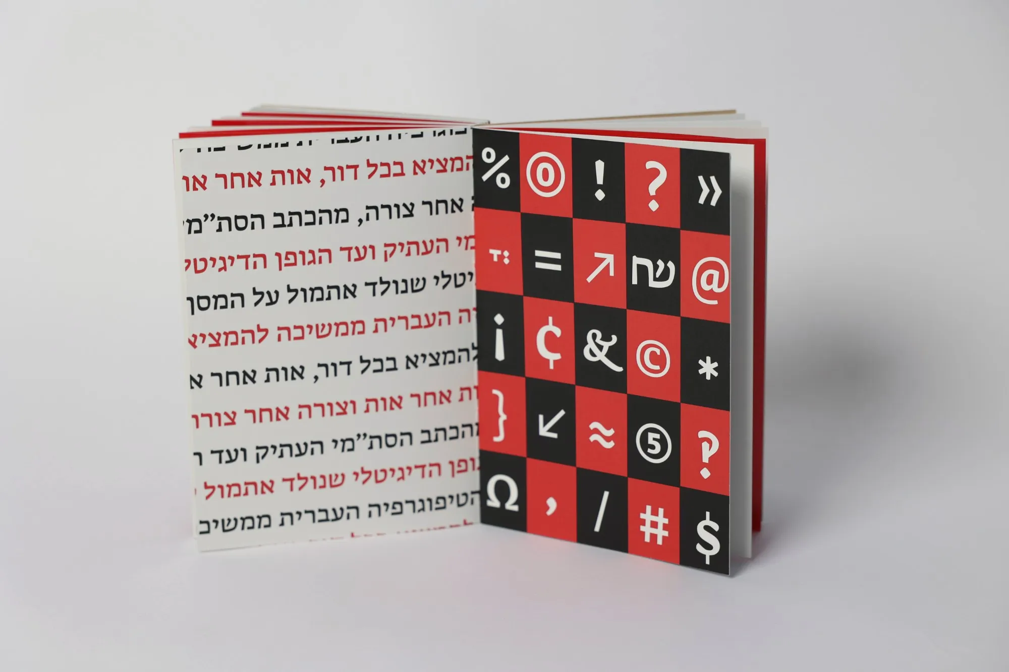
Inside the catalogue
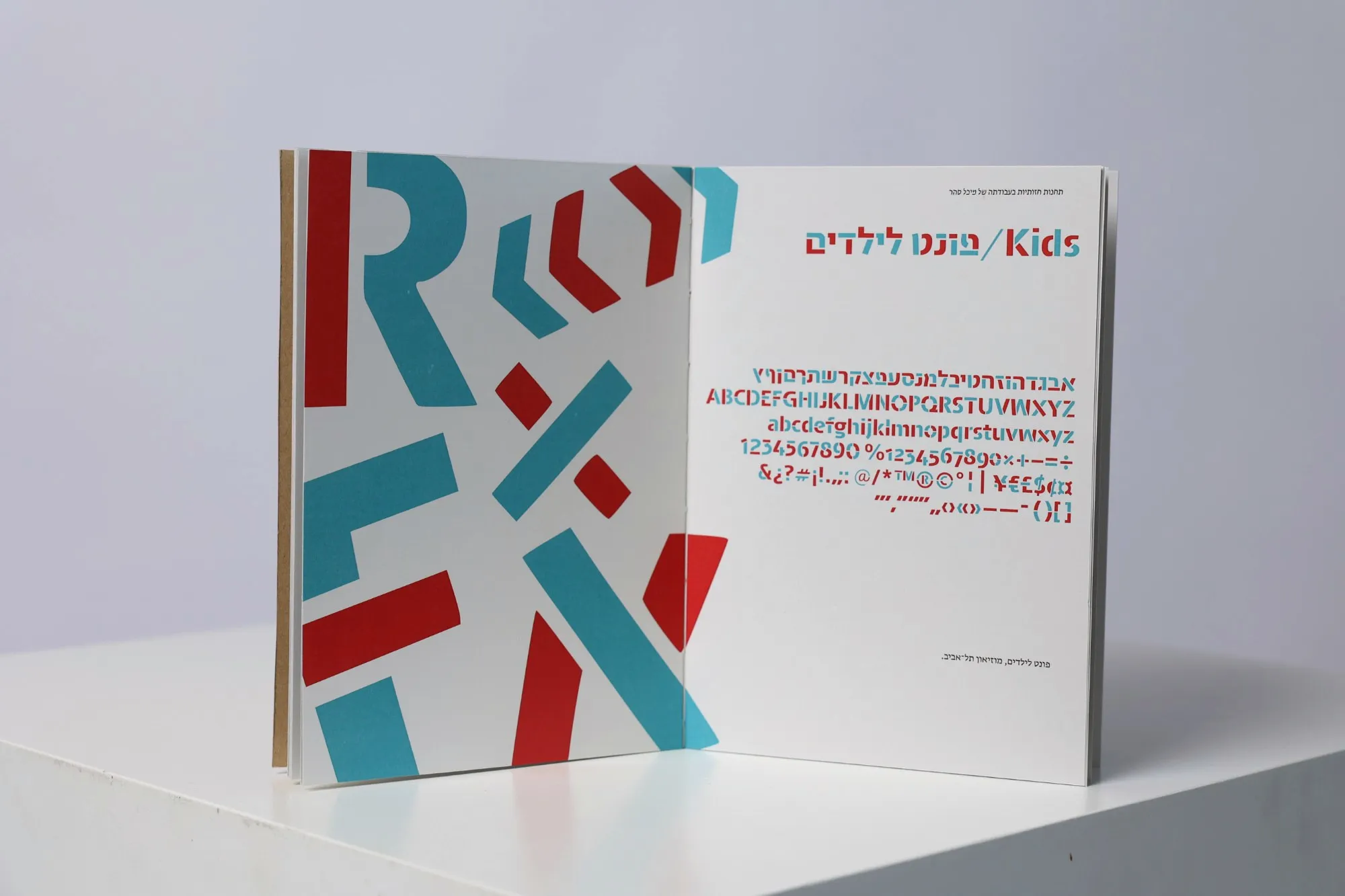
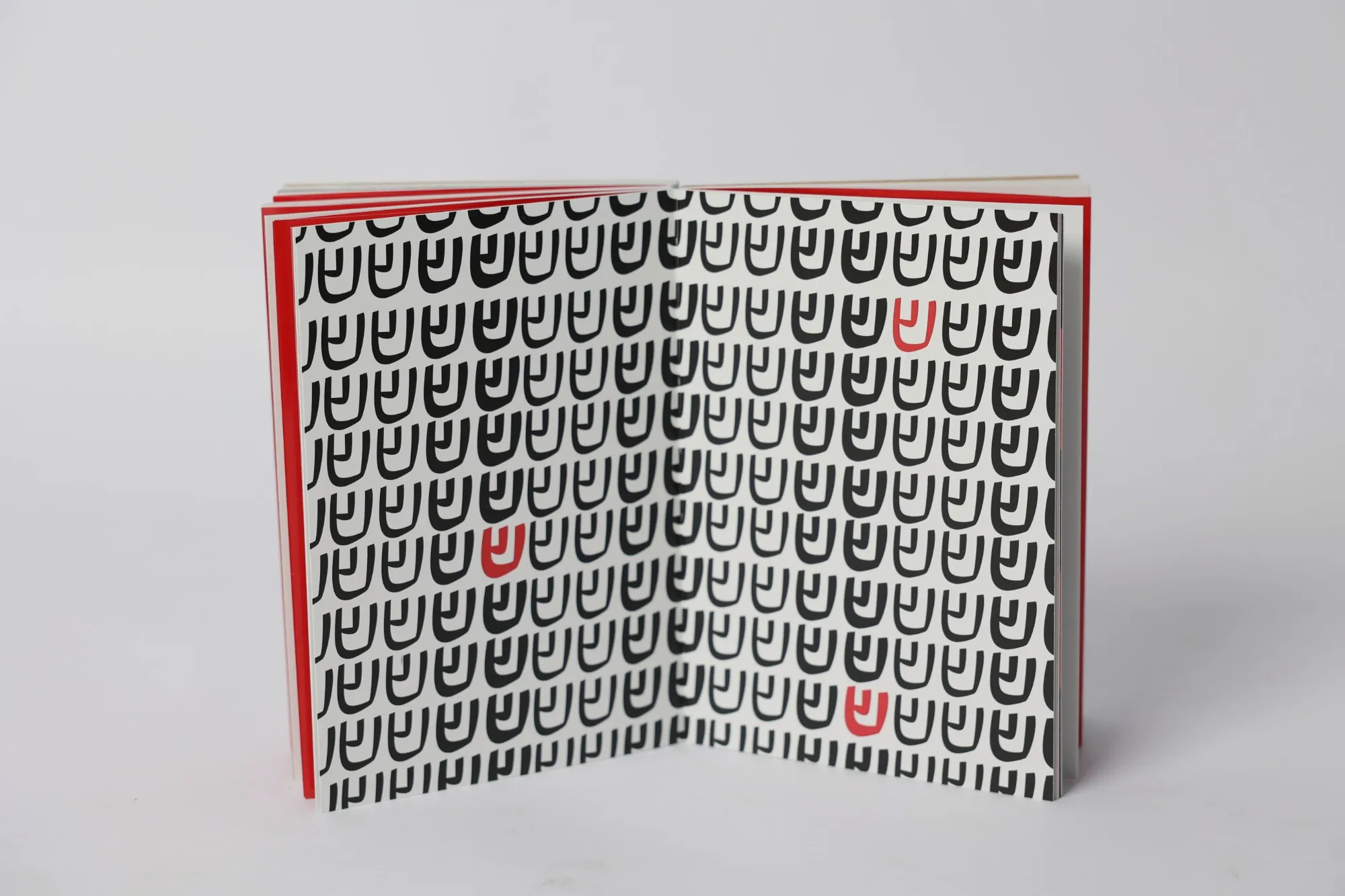
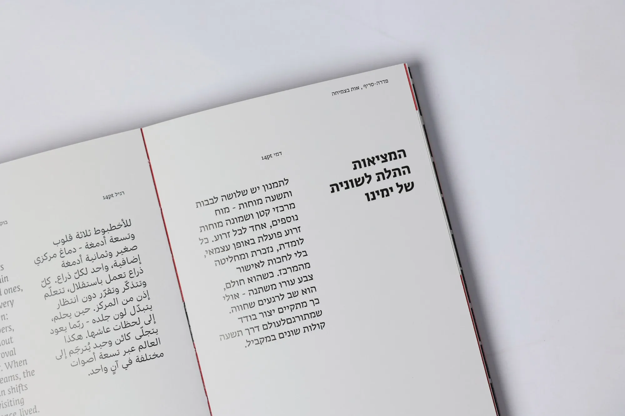
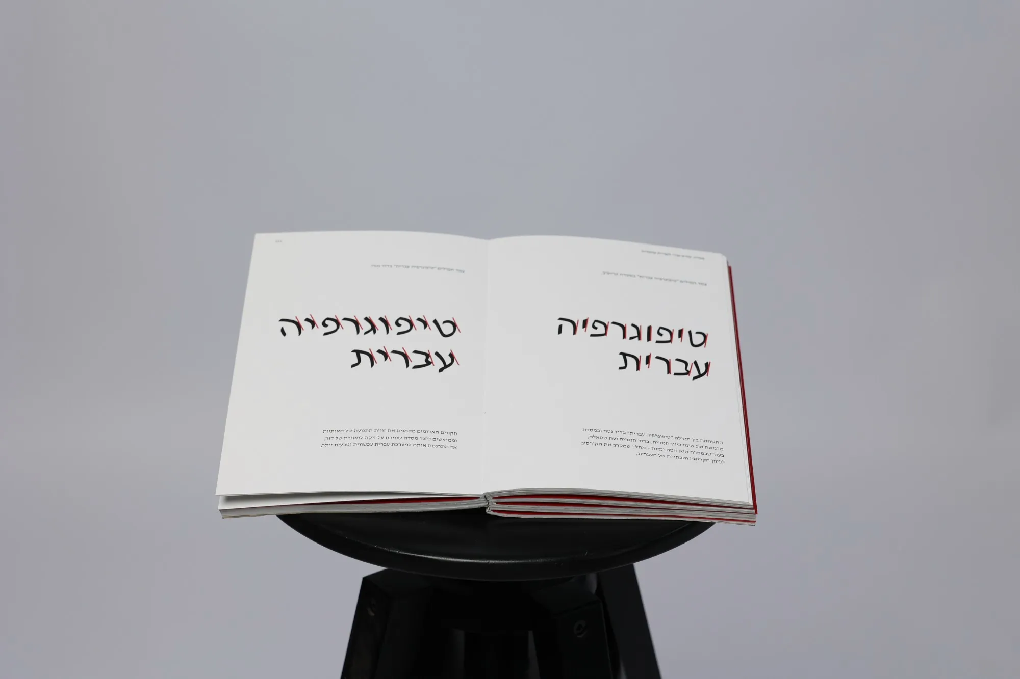
On show
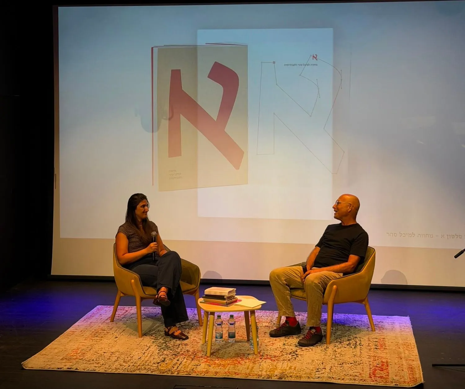
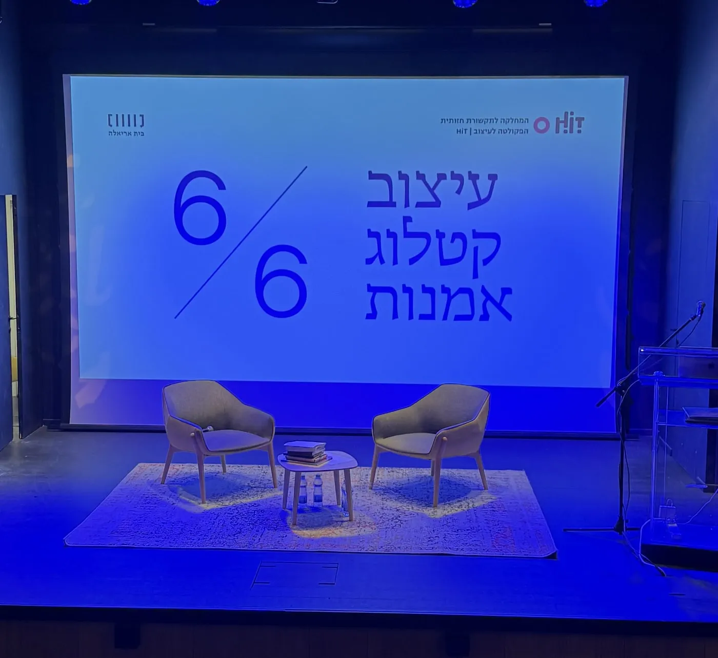
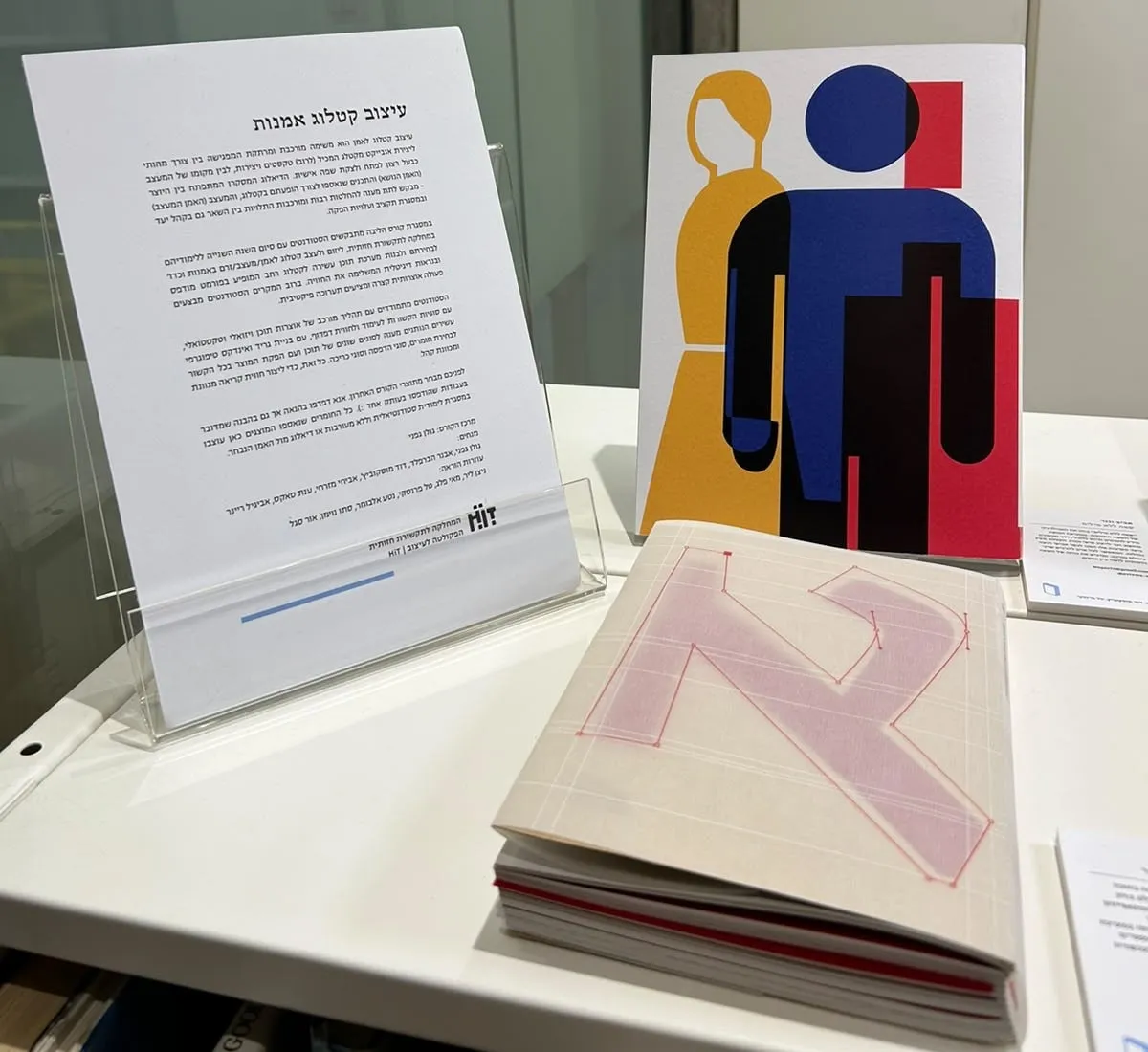
Selected for a month-long display at Beit Ariela.
Part of the “Art Catalog Design” exhibition.